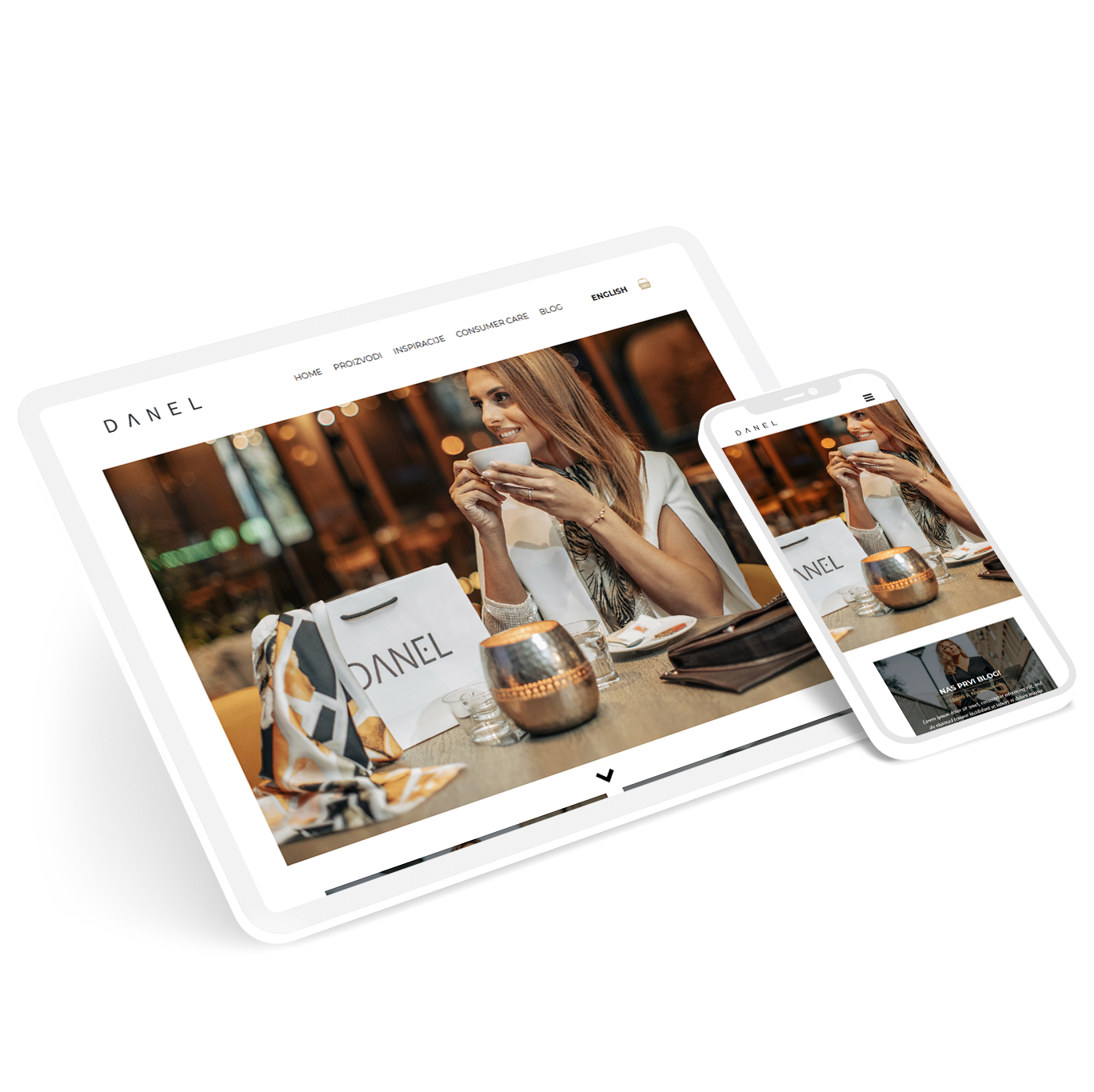
Optimizing for Style & Impact: A Deep Dive into Danel's Responsive E-commerce Website
Introduction
Danel is a fashion brand from the Balkans that aims to dress women aged 18-65 for confidence, comfort, and mindful living. They focus on unique pieces that fit well and support ethical sourcing and local communities. In this case study, we will explore Danel’s e-commerce website and see how they built a loyal community of women who care about looking good and doing good.
Disclaimer: This case study serves as a portfolio presentation and may contain some inaccuracies in data or events.
Understanding User Needs through Empathy
To truly understand the challenges and aspirations of Danel's target audience, we embarked on a journey of empathy. Through in-depth interviews with potential customers, we sought to uncover their thoughts, feelings, and behaviors surrounding online fashion shopping. By actively listening to their stories, we aimed to identify pain points, celebrate delights, and unveil hidden needs that could inform the design of Danel's e-commerce experience.
Research goals:
- Define user personas based on research findings to inform targeted design decisions.
- Prioritize website optimization efforts based on identified user pain points and frequency of occurrence.
- Develop design solutions tailored to address specific user needs and improve the overall shopping experience.
Interview Questions:
- When was the last time you bought fashion garments online? What factors led you to choose that method over physical shopping?
- What features or functionalities particularly appeal to you in the purchasing process?
- Can you describe any specific steps or elements in the checkout process that felt confusing or frustrating? How did that impact your overall experience?
- If you could wave a magic wand and improve anything about online shopping experience, what would it be and why?
Recruiting participants:
To ensure insights relevant to Danel's target audience, we contacted existing customers directly through private messages on the business owner's Instagram page.
Empathy maps:
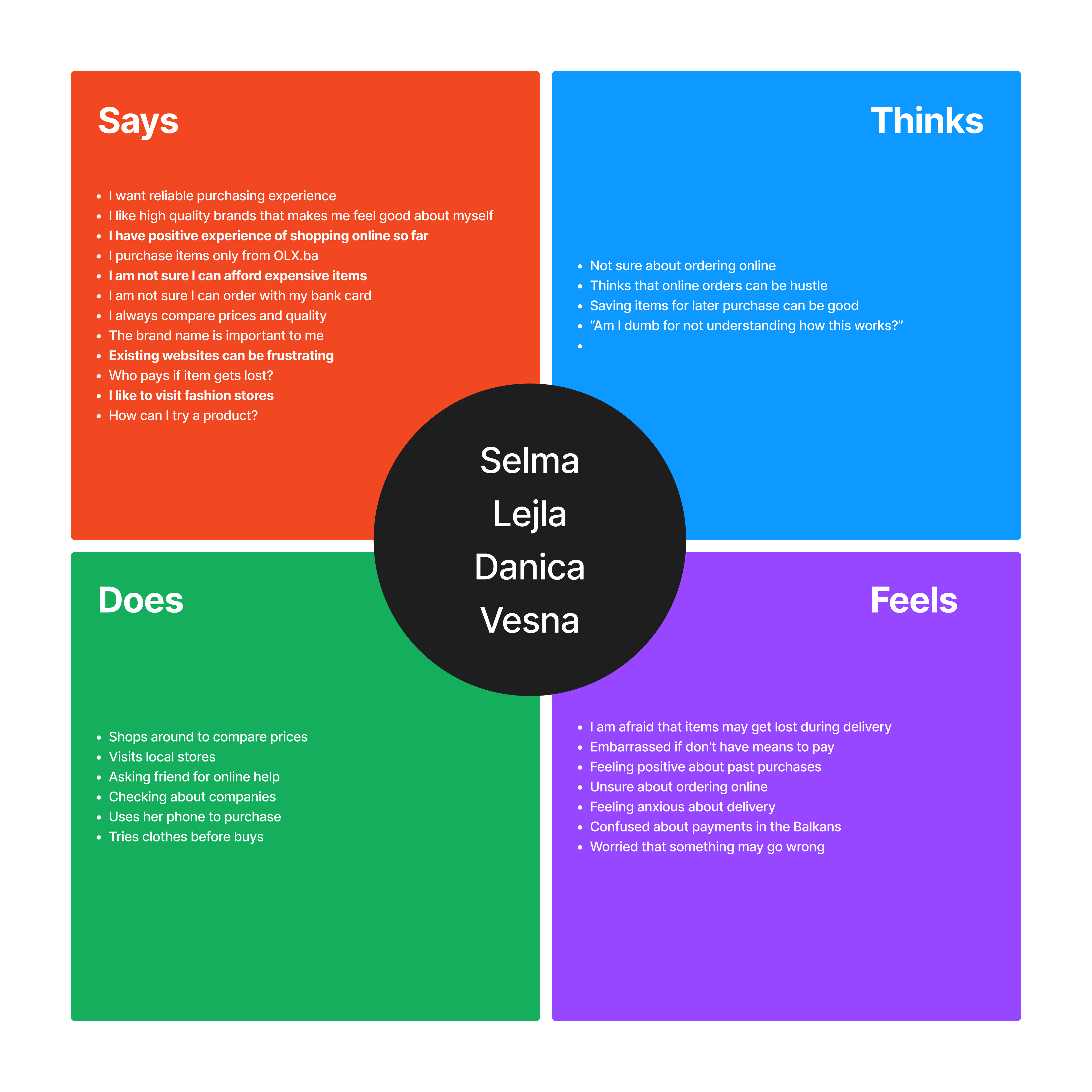
Individual empathy maps from participants were grouped by common themes and color-coded to create a comprehensive aggregated map. This visual representation of user needs and pain points will be instrumental in informing the next stages of design and development, ensuring a user-centric approach to designing Danel's e-commerce platform.
User Research: Deep Dive into Women's Online Shopping Habits in the Balkans
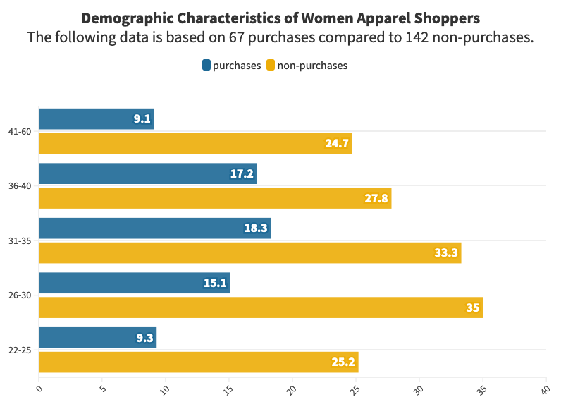
To understand the online shopping behavior of our target audience, we conducted a focused study with 40 women aged 22-60 in the Balkans. Our findings reveal a dynamic and increasingly online-oriented market, driven by both practical and emotional factors.
Price and convenience remain key motivators: Balkan women are making an average of 2.3 apparel purchases online per month, primarily attracted by the ease and affordability compared to traditional shopping. Interestingly, our study indicates that shopping across both foreign and domestic e-commerce platforms is common, suggesting a discerning and value-conscious customer base.
Beyond practicality, shopping for pleasure: The study uncovers a dualistic approach to online shopping. While some women are "problem solvers," seeking to fulfill specific needs efficiently, others find enjoyment in the experience itself. These "hedonic shoppers" view online browsing as a form of entertainment, appreciating the playful and engaging aspects of the platform.
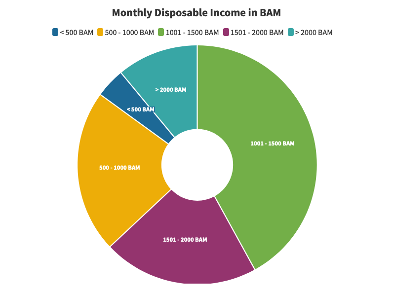
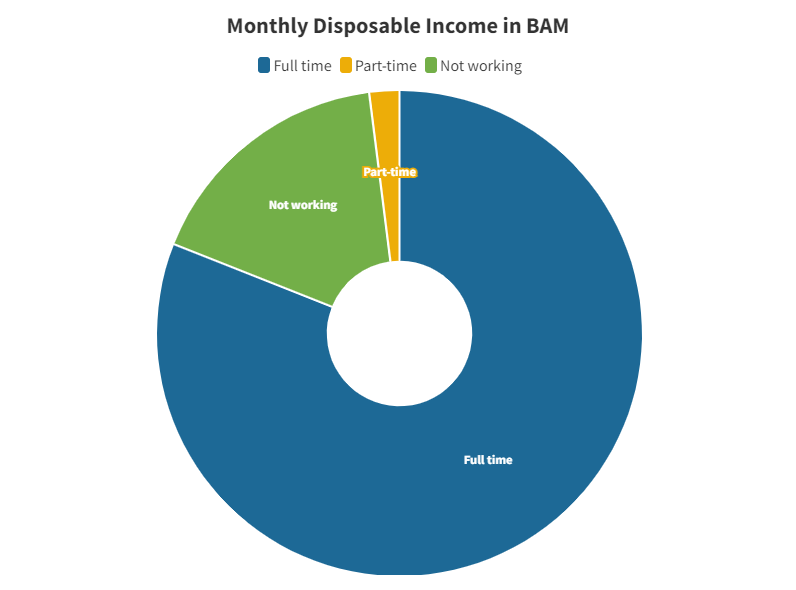
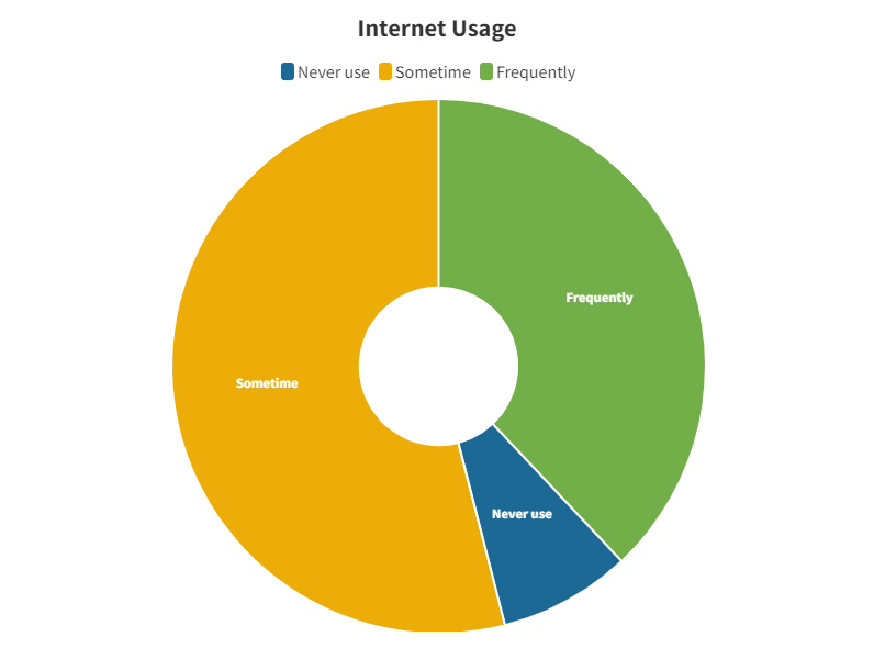
Exploring user demographics: Our findings highlight specific purchase tendencies within the target audience. Women aged 26-35 emerged as the most frequent online apparel shoppers, followed by those in the 1001-1500 BAM monthly income bracket. Interestingly, full-time employment seemed to correlate with higher online shopping activity, whereas internet usage varied, with 38% of participants relying heavily on the internet while 8% rarely use it.
Mixed emotions towards online security: While 77% of participants find online shopping generally easy and clear, security concerns linger. Despite 73% reporting they feel safe shopping online, the same percentage expressed distrust in providing personal information through internet service providers. This highlights the need for robust security measures and transparent data handling practices to build trust and encourage further online engagement.
Embracing the future of online fashion: This study paints a clear picture of Balkan women increasingly embracing online shopping as a convenient, price-conscious, and even enjoyable experience. By incorporating these insights into the design of Danel's e-commerce platform, we can create a user-centric experience that caters to both the practical and emotional needs of our target audience, fostering loyalty and growth in the ever-evolving world of online fashion.
Personas: Architype representation of a group of users
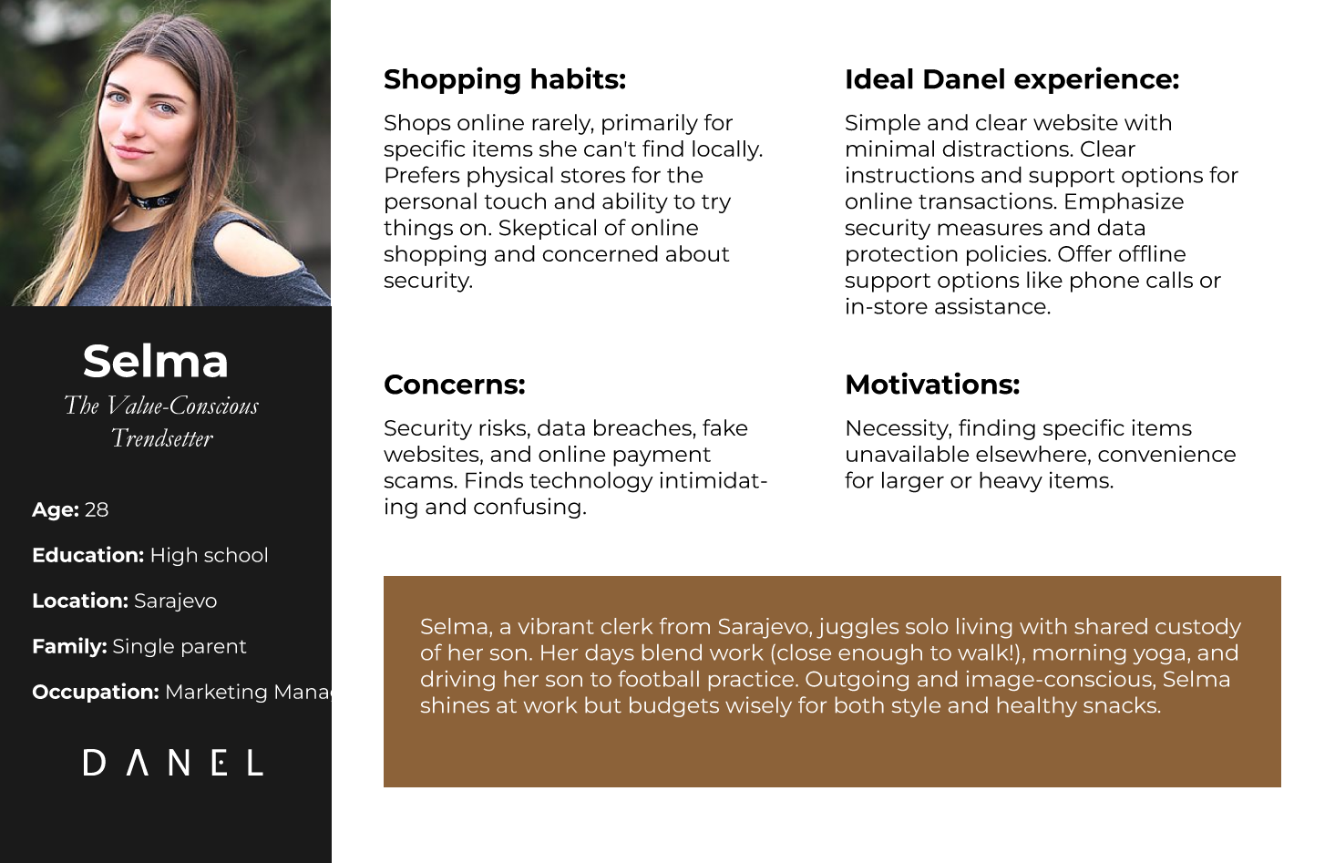
The Danel's personas represent the diverse tapestry of our customers, with unique styles, motivations, and tech savviness. Through their stories, we'll explore their online shopping journeys, uncovering desires, frustrations, and hidden opportunities.
User stories
A user story is a fictional one-sentence story told from the persona’s point of view to inspire and inform design decisions. Here is example of Selma's user story:
"As a busy tech-savvy young mom juggling work and family, I want to effortlessly find stylish, affordable outfits for special occasions like a date night, all within a seamless checkout experience that feels secure and saves me precious time."
User Journey
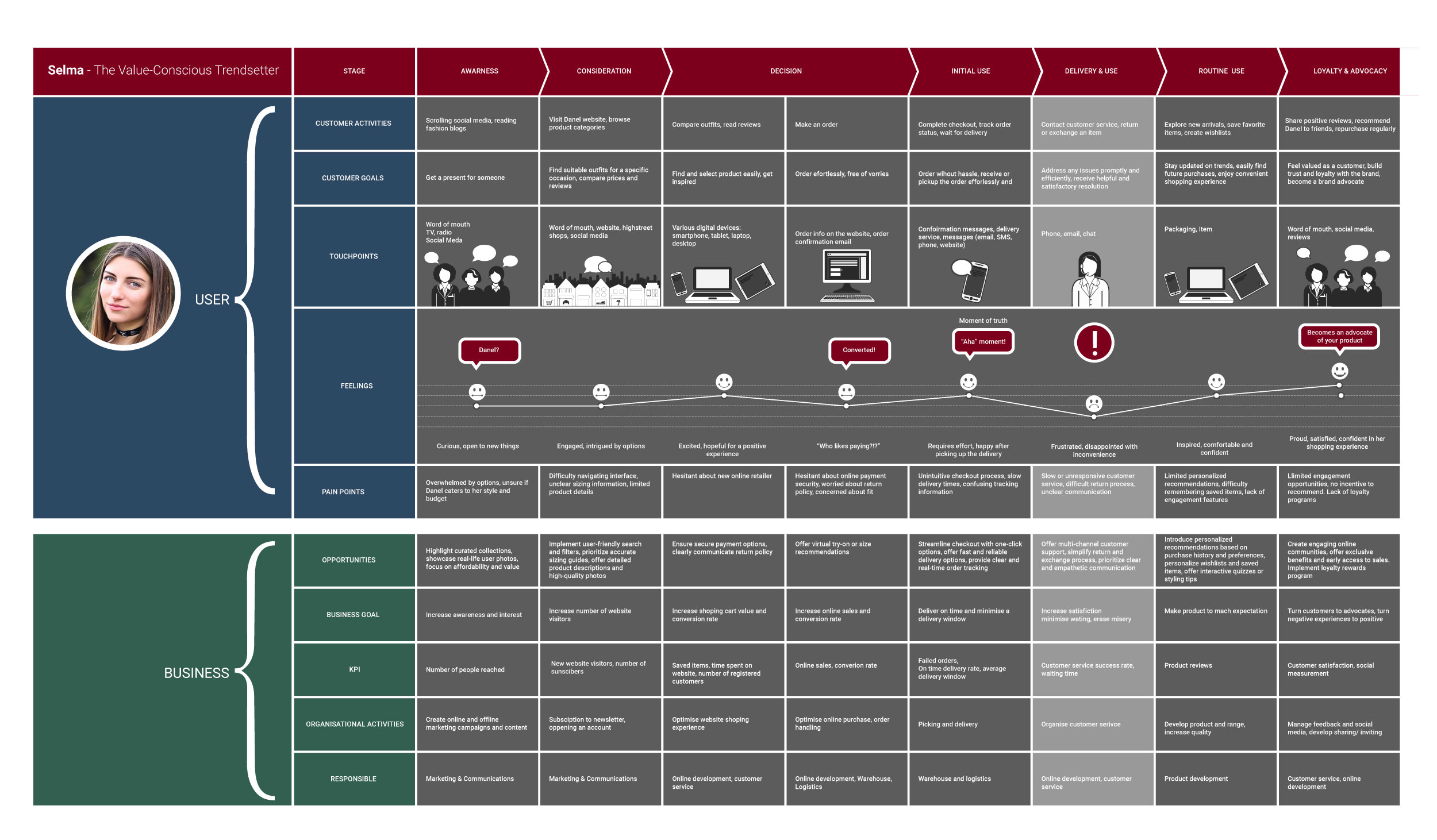
We imagined ourselves in our user's shoes, mapping out their steps and feelings as they journey towards their goal. This roadmap, called a user journey map, helps us build a seamless experience that meets their needs.
Wireframing
Diving deeper! Armed with the insights gleaned from empathy research, we set our sights on the wireframing stage. But first, a crucial step: crafting a goal statement to guide our design decisions and ensure each click and tap resonates with our users' needs. Buckle up, we're about to translate emotions into tangible layouts!
Goals statement:
Empowering fashion-conscious individuals to effortlessly discover and purchase high-quality, affordable garments through a seamless online experience.
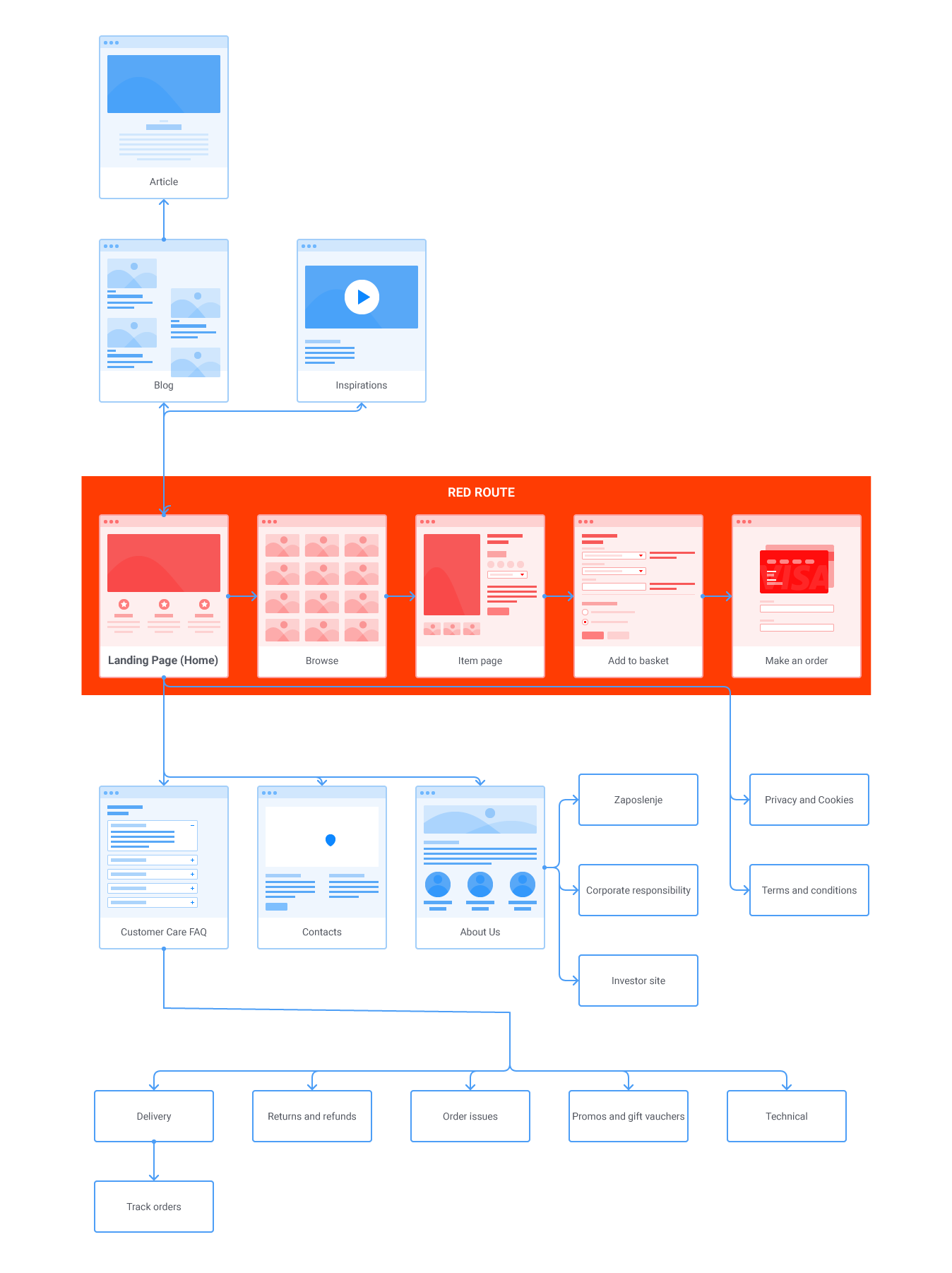
User flow:
How do we create an online experience that feels intuitive and inviting, where every path leads to style satisfaction? User flows hold the key. By mapping out the logical progression of actions and decisions, we'll ensure effortless navigation and streamline the path to purchase.
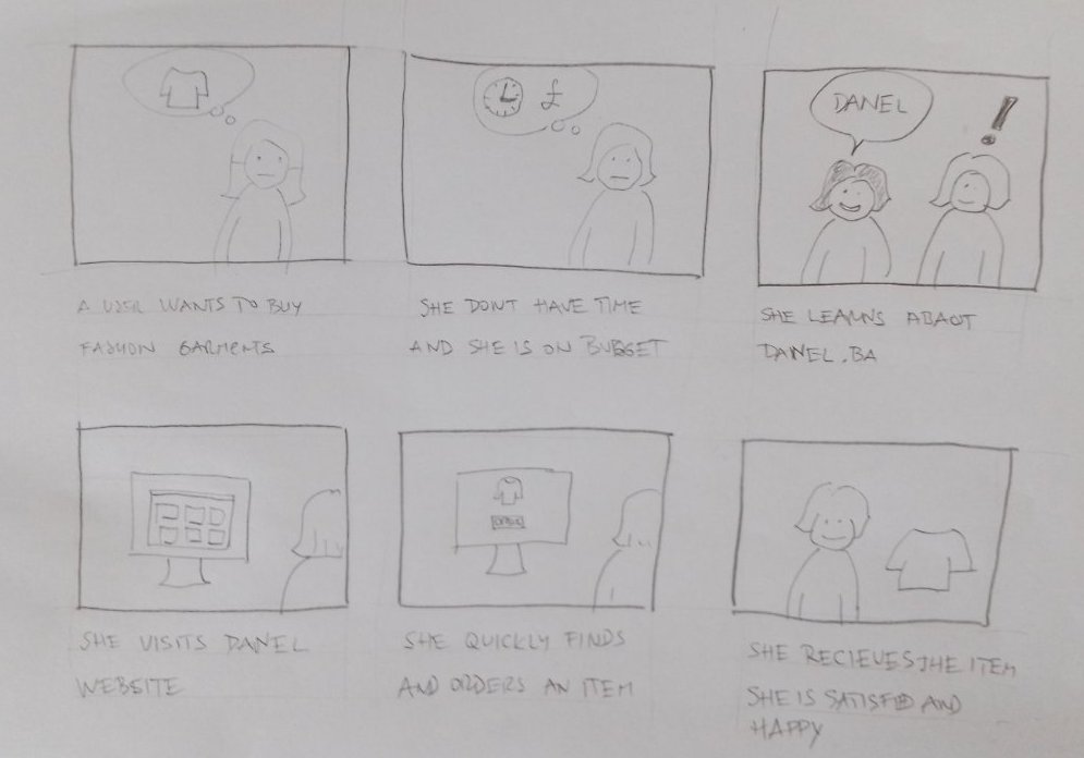
Sketching it Out: How Quick Doodles Enhance UX Understanding
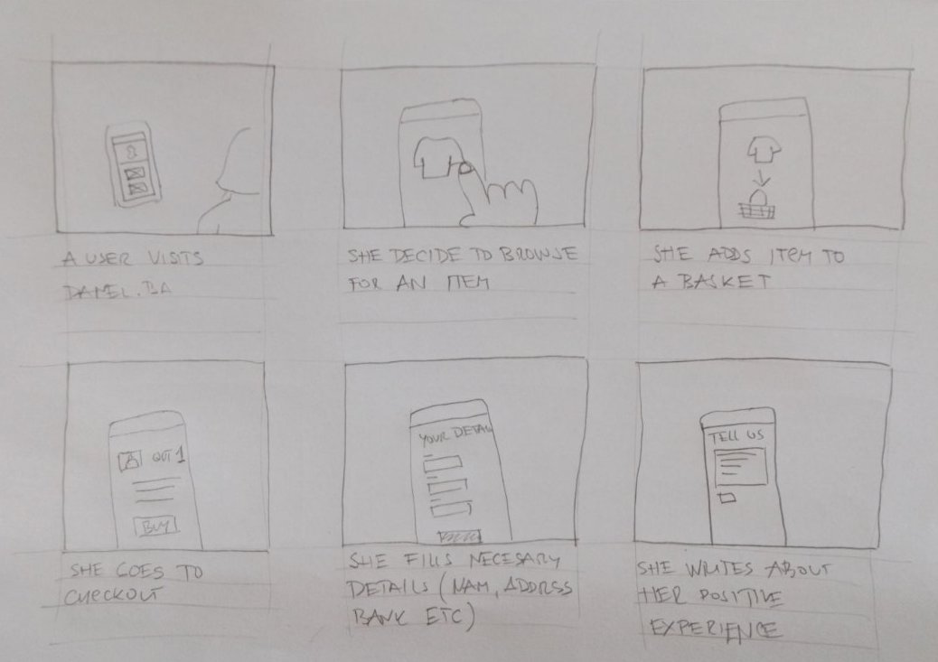
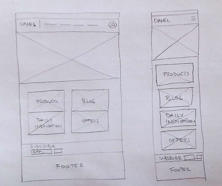
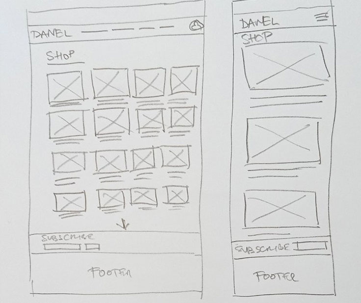
Before diving into high-fidelity wireframes, I first explored the user's journey through storyboards. These quick sketches helped me visualize and enhence the overall flow and emotions of the experience. Then, I created low-fidelity paper wireframes to map out the basic layout and functionality, focusing on key interactions and information architecture. This two-step approach allowed me to refine the user experience before investing in detailed design, ensuring the final product truly addresses their needs.
Digital Wireframing
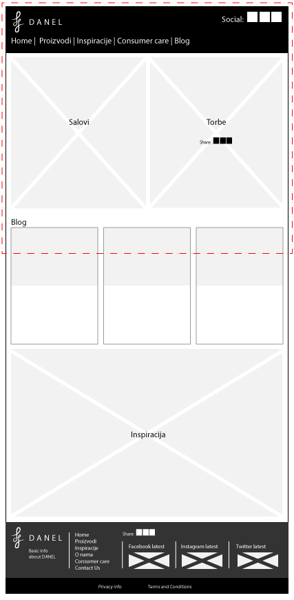
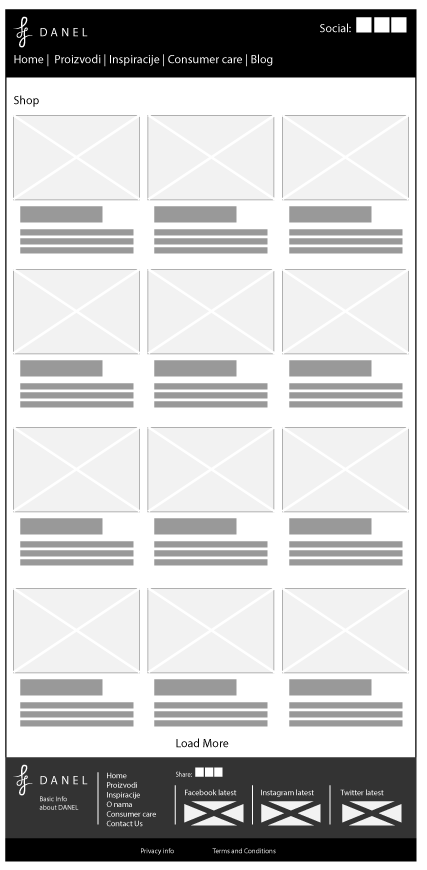
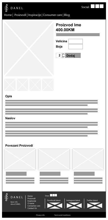
Paper prototypes were fun, like building a mini-Grade X with sticky notes and markers. But let's face it, they weren't exactly digital marvels. So, we grabbed our tech tools and dived into the pixel pool – wireframing time! These interactive skeletons might look like fancy to-do lists, but they're way more. They're our chance to test the flow, make sure users aren't getting lost in the digital maze, and polish the experience before we dress it up
Visual designs
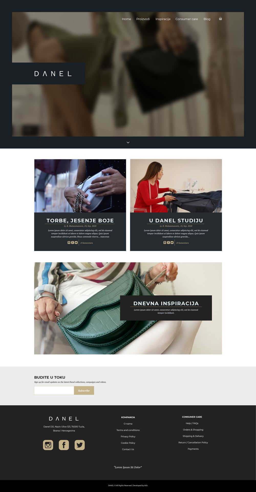
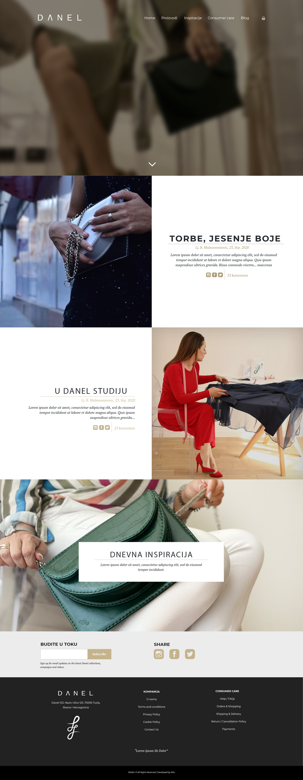
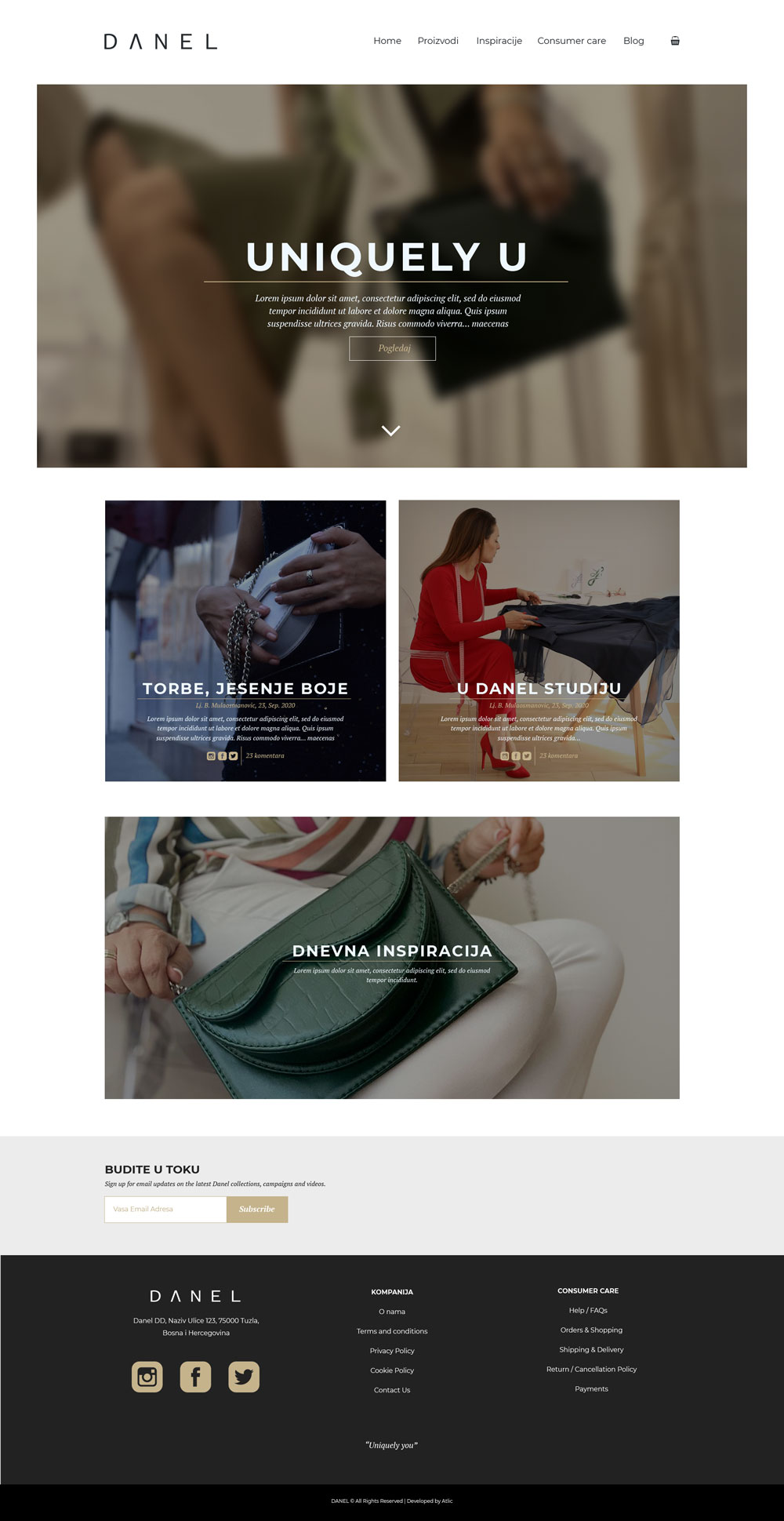
We envisioned three high-fidelity design options for the client's WordPress website, recognizing the power of A/B testing for optimization. Ultimately, their clear preference for one version (final version) and budgetary constraints prompted a successful direct launch. While a prototype could have provided valuable early user feedback, their decision prioritized swift action and minimized development costs.
Usability study
To ensure the Danel.ba website delivers a seamless and intuitive shopping experience, we conducted a comprehensive usability test with real users after the website was fully developed. Their valuable feedback guided us in refining the design and functionality to better meet their needs.
Delve into the details of our usability testing process and discover the key insights that shaped the website's evolution. Download the full report here:
Danel Usability Test - Participant Guide: danel-usability-test-guide.pdf
Danel Usability Test - Report: danel-usability-test-report.pdf
The initial usability test yielded invaluable insights, exposing friction points and user pain points that hindered navigation, information access, and checkout flow. Armed with this feedback, we dove back into the design process, meticulously addressing each identified issue. The result? A final website crafted around user needs, streamlined for intuitive exploration, and optimized for a seamless purchasing journey. Every click, tap, and swipe now feels effortless, transforming Danel.ba into a true user-centric shopping haven.
Final Words: From Flaw to Flow - A UX Transformation Case Study
The revamped Danel.ba wasn't just a facelift; it was a fresh start. The new website launched to rave reviews on Instagram, with users commenting on the ease of navigation, the informative product pages, and the effortless checkout experience.
Our work on Danel.ba is a testament to the power of iterative design and user-centered thinking. We learned invaluable lessons about continuous improvement, the value of user feedback, and data-driven decisions.
Visit the New Danel.ba and Experience the Magic: www.danel.ba