Bosch Grade X: Designing a Browser-Based Vehicle Diagnostic Tool
Introduction
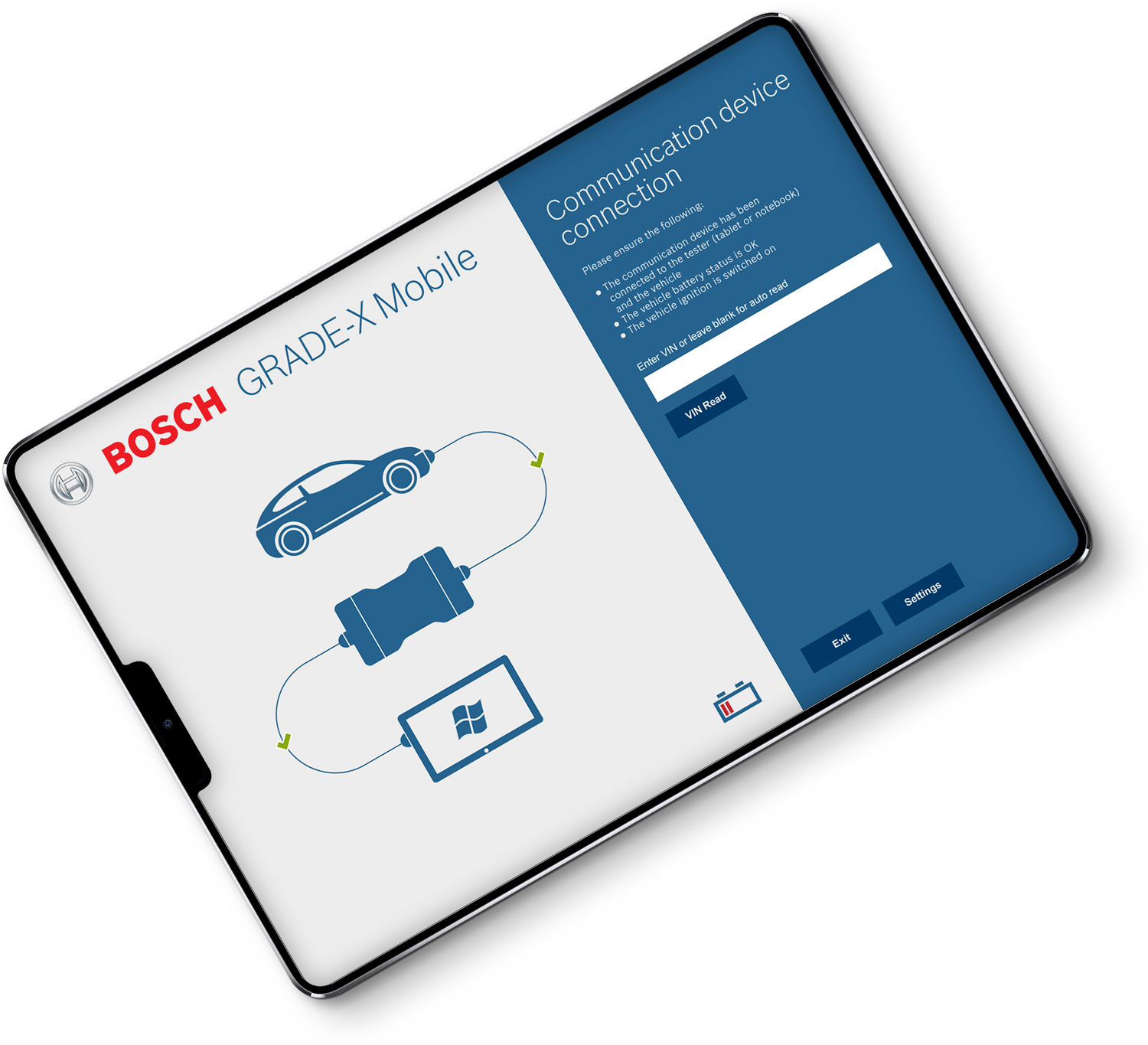
Grade X is Bosch's browser-based vehicle diagnostic tool. It helps technicians check vehicle status and troubleshoot issues. I revisit this project to showcase the evolution of our UX understanding and my growth in the field.
Disclaimer: This case study explores the design process and learnings from a 2015 project. While some details may not be exact, the insights and approaches presented remain relevant and valuable.
The mission was clear: empower technicians. We aimed to create an intuitive and easy-to-navigate interface with a pleasing and efficient design. Grade X was a testament to our dedication to Bosch's high standards in creating tools that technicians rely on daily.
This case study highlights the challenges and successes in designing Grade X, reminding us of our progress and commitment to human-centered design.
Discovery Goals: Aligning Business Needs with Global User Experience
Business Objectives
- Enhance brand reputation: Aim for a 4.5+ average star rating on industry-specific review platforms by fostering a positive global user experience.
- Maintain Bosch standards: Deliver a reliable and efficient diagnostic tool that aligns with Bosch's reputation for quality and innovation.
- Secure partnerships: Position the software as a preferred diagnostic solution, attracting interest from vehicle manufacturers for direct integration.
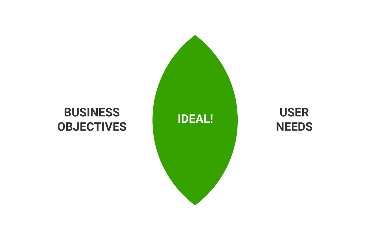
User Goals
- Intuitive interface: Design an easy-to-learn and navigate interface, minimizing training time and maximizing usability for technicians of all skill levels.
- Seamless migration: Ensure a smooth transition from existing platforms, especially for technicians with limited computer experience.
- Customizable workspace: Allow technicians to personalize their experience by hiding or minimizing rarely used tools.
Additional Considerations:
- Global usability: Prioritize design choices that cater to diverse cultural and language needs for seamless adoption across different regions.
- Partnership alignment: Incorporate feedback from vehicle manufacturers to ensure the software meets their specific requirements and workflows.
Evaluation of existing software: Uncovering Opportunities for Improvement
Usability testing
Stakeholder feedback and a firsthand analysis revealed key shortcomings in the current application: overflowing menus, inconsistent button placement, and an unintuitive search function. These issues led to a confusing and time-consuming user experience.
To understand the full scope of these issues and anticipate future needs, we conducted usability testing with 18 participants: eight experienced diagnosticians and ten younger potential users unfamiliar with the software. Each participant attempted specific tasks like connecting to vehicles, finding diagnostic tools, and accessing car information. We measured task completion time, error rate, and user satisfaction through observation and surveys.
This evaluation provided valuable insights into pain points and potential improvements, setting the stage for a complete UI/UX overhaul to simplify workflows and empower users of all skill levels.
Testing effectiveness
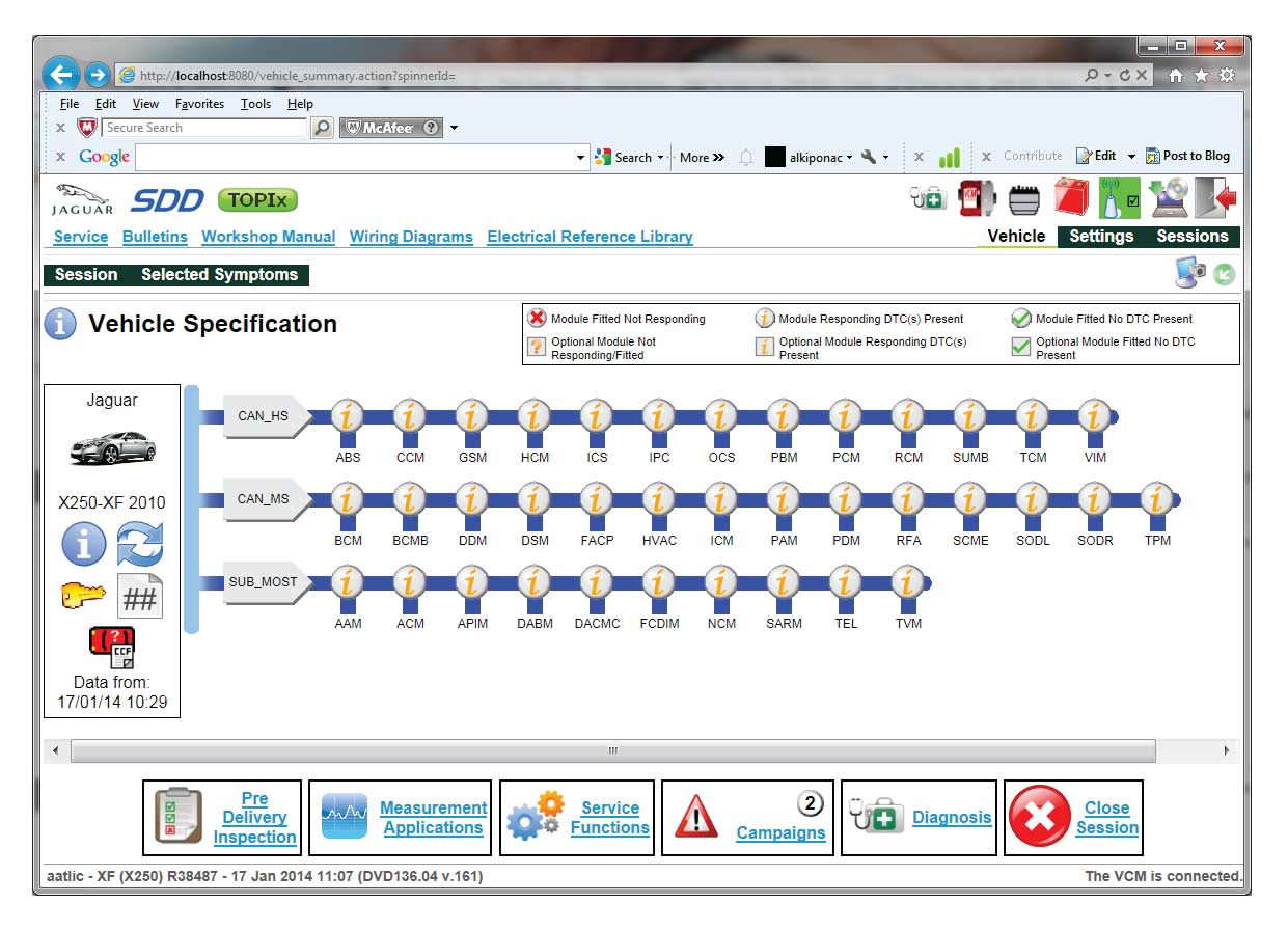
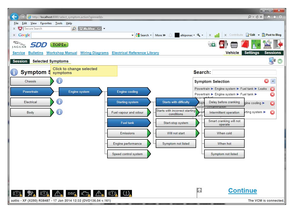
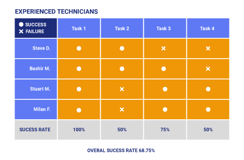
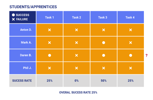
A quick look at Grade X's dashboard reveals information overload and potential confusion. Usability testing confirmed this, showing significant roadblocks for both experienced and novice users.
Experienced Users Stumble at 62%:
Experienced technicians had a 62% success rate. The cluttered screen, filled with text, buttons, and icons, made it difficult for users to find what they needed. Our redesign must prioritize organization, group related functions logically, and minimize unnecessary elements.
Inconsistency Disrupts Workflow:
Tool placement and functionality were inconsistent, adding unnecessary cognitive load. A standardized UI based on best practices in automotive diagnostics will streamline workflows and make experienced users feel comfortable.
Effective Tool Design:
One tool with a clear layout and isolated position boosted user success rates. This example shows the power of intuitive design and suggests simplicity can greatly enhance user experience.
Challenges for Novice Users:
For newcomers, the Grade X dashboard was overwhelming. The information avalanche, unclear navigation, and technical jargon made the tool difficult to use. The redesign must prioritize information chunks, context-sensitive help options, and interactive tutorials to ease the learning curve. A revamped navigation system with intuitive pathways and consistent tool placement will help guide users.
Simplifying Technical Language:
Technical jargon alienated novice users. Replacing jargon with simpler language, offering in-context explanations, and using user-friendly synonyms can make the tool more accessible. Inclusivity is key to a successful diagnostic tool.
From Insights to Action:
Identifying pain points is just the beginning. Data-driven insights from user testing must guide every redesign decision. Prioritize visual clarity, standardized functionality, guided assistance, and clear communication to empower users of all skill levels. This redesign is an opportunity to build a trusted companion for technicians, streamlining workflows and improving the diagnostic experience.
Who are the users?
Understanding Context and Needs:
- Workplace: We observed technicians in vehicle service centers, analyzing their workflow, tools, and challenges within their actual working environment. This real-world context is crucial for identifying genuine pain points and designing solutions that seamlessly integrate into their daily routines.
- SSkill Levels: We recruited a diverse group of participants, including experienced technicians and apprentices. Understanding this spectrum of skill levels allowed us to develop a user-centered design that caters to everyone, from rookies to veterans.
- Demographics: While age wasn't the primary focus, we considered a range of ages to ensure our findings represented the technician population. This holistic approach ensures the redesigned Grade X will remain relevant and effective for all users.
Context of Use:
By delving into the context, behaviors, and demographics of our users, we move beyond assumptions and create a data-driven foundation for the redesign. Contextual inquiries, interviews, and observations in real-world scenarios provided invaluable insights into user needs, frustrations, and expectations. This deep understanding allows us to tailor the design to their specific realities, ultimately leading to a more intuitive, efficient, and enjoyable experience for every technician.


Field Visit
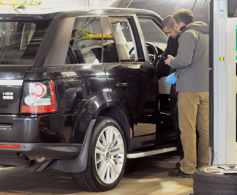
To truly grasp the challenges and aspirations of our users, we ventured into their domain—the vehicle service centers where Grade X is employed daily. Through observations and interviews, we gained invaluable insights that will shape the redesign process. Here are the most compelling findings:
Observations & Insights:
- Technicians' Workflow: Observed technicians searching for help online, adjusting volume (no software sound), and younger ones learning from experienced colleagues. Managers primarily observed or assisted.
- Technology Familiarity: Tested basic digital skills on laptops (neutral environment).
- Technology Familiarity: Tested basic digital skills on laptops in a neutral environment.
- Quick Access: Technicians desired faster access to specific tools, describing the current layout as "hectic."
Key Learnings:
- Simple and Intuitive Interface: Design an interface with easy access to frequently used tools.
- Clear Audio Feedback: Ensure clear audio feedback and seamless online support integration.
- Laptop Compatibility: Prioritize laptop compatibility for technician comfort and efficiency.
Understanding the experience: Analysing the outcome
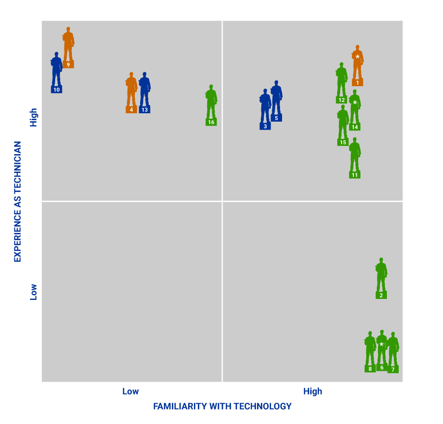
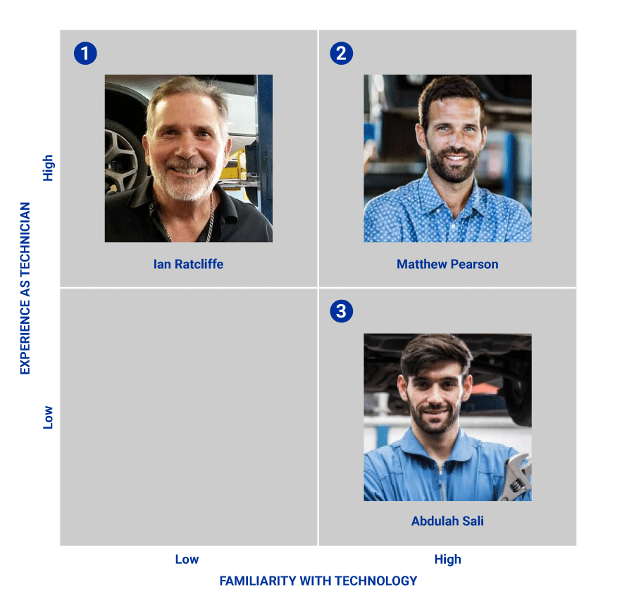
Back in the office, I reviewed field visit recordings and participant data. Mapping their experiences and tech savvy created a visual landscape of our user base. This, along with quantitative and qualitative data, led to the creation of personas: fictional archetypes representing key user groups.
Insights and Pain Points:
- Challenges of Usability: As expected, user feedback confirmed the software's complexity. Difficulty with navigation, unintuitive interfaces, and inconsistent labeling proved major hurdles, particularly for new users.
- Digital Divide: Younger participants navigated the digital environment with ease, highlighting a potential generational gap in comfort with technology. Senior users, while efficient with existing software, exhibited varying success with Grade X depending on their specific expertise.
- Fears and Frustrations: Some concerns emerged, particularly among older users. Small interfaces caused discomfort, battery life anxieties arose during vehicle repairs, and network connectivity issues added to user stress. Broken links and unclear interactive elements led to confusion and frustration, with instances of users even hitting icons expecting a response. Additionally, anxieties surrounding stopping ongoing processes surfaced.
Moving Forward:
These insights are invaluable for shaping a more accessible and user-friendly Grade X experience. Addressing the software's complexity, simplifying navigation and labeling, and offering user-friendly digital interactions will be crucial. Additionally, catering to different comfort levels with technology, assuaging anxieties around battery life and connectivity, and providing clear feedback within the interface are essential considerations.
Creating personas
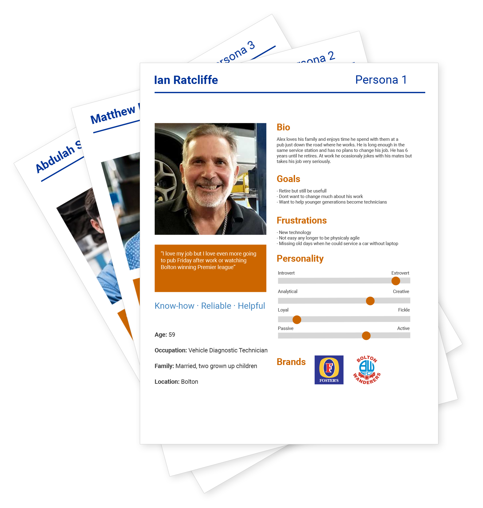
Based on a comprehensive analysis of all study data, we crafted three detailed personas. These personas went beyond demographics, incorporating realistic personality traits and user behaviors. This data-informed empathy guided us throughout the design process, ensuring every decision centered on the authentic experiences of our users.
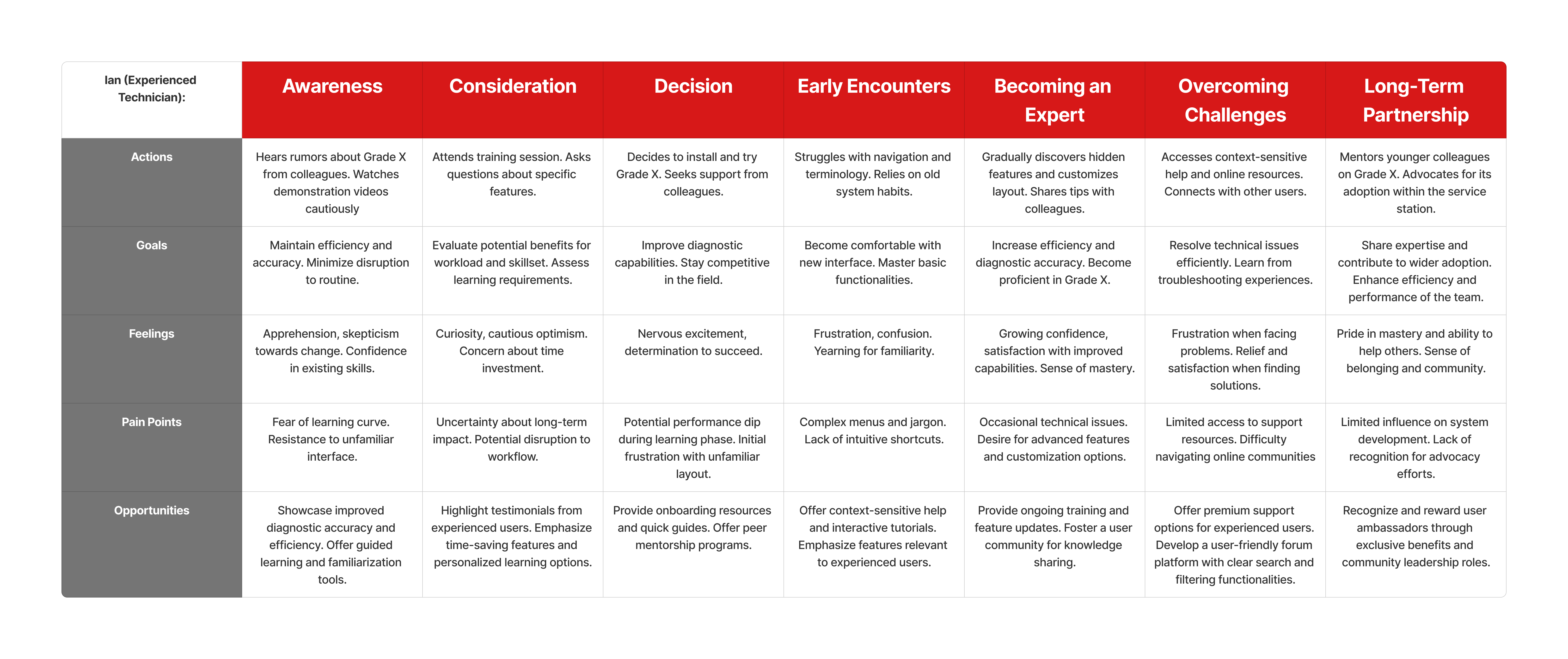
User Journey: Grade X Empowers Every Technician
From veterans like Ian navigating initial challenges, to apprentices like Abdullah mastering skills quickly, and managers like Matthew boosting efficiency, Grade X transforms every technician's journey. This case study and user journey map show how Grade X meets diverse needs, fosters confidence, and redefines success for all technicians.
Information Architecture: Flow to facilitate user tasks
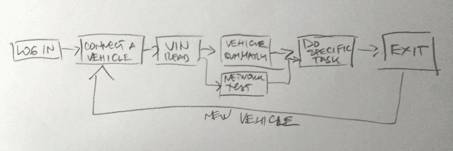
Creating red route
Persona insights guide us to an information architecture focused on user journeys and critical tasks. We'll build a "red route" highlighting essential features all technicians need daily, ensuring quick navigation and efficiency. Less frequent needs? No worries! Discoverable pathways offer access to advanced tools without cluttering the core experience. This prioritized design boosts usability, optimizes workflow for each technician, and lays the foundation for future growth.
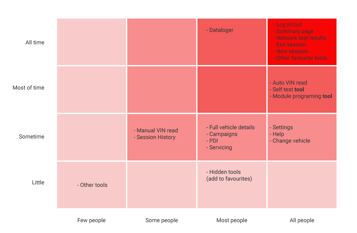
Mapping Grade X to prioritise tasks
After prioritizing key tasks for each technician persona, we organized Grade X's content in a collaborative workshop. We categorized every diagnostic tool and application element, mapping the critical path technicians take during vehicle diagnosis. By aligning content with user needs and optimizing workflow, we are making Grade X a symphony of efficiency for every technician.
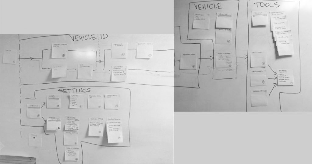

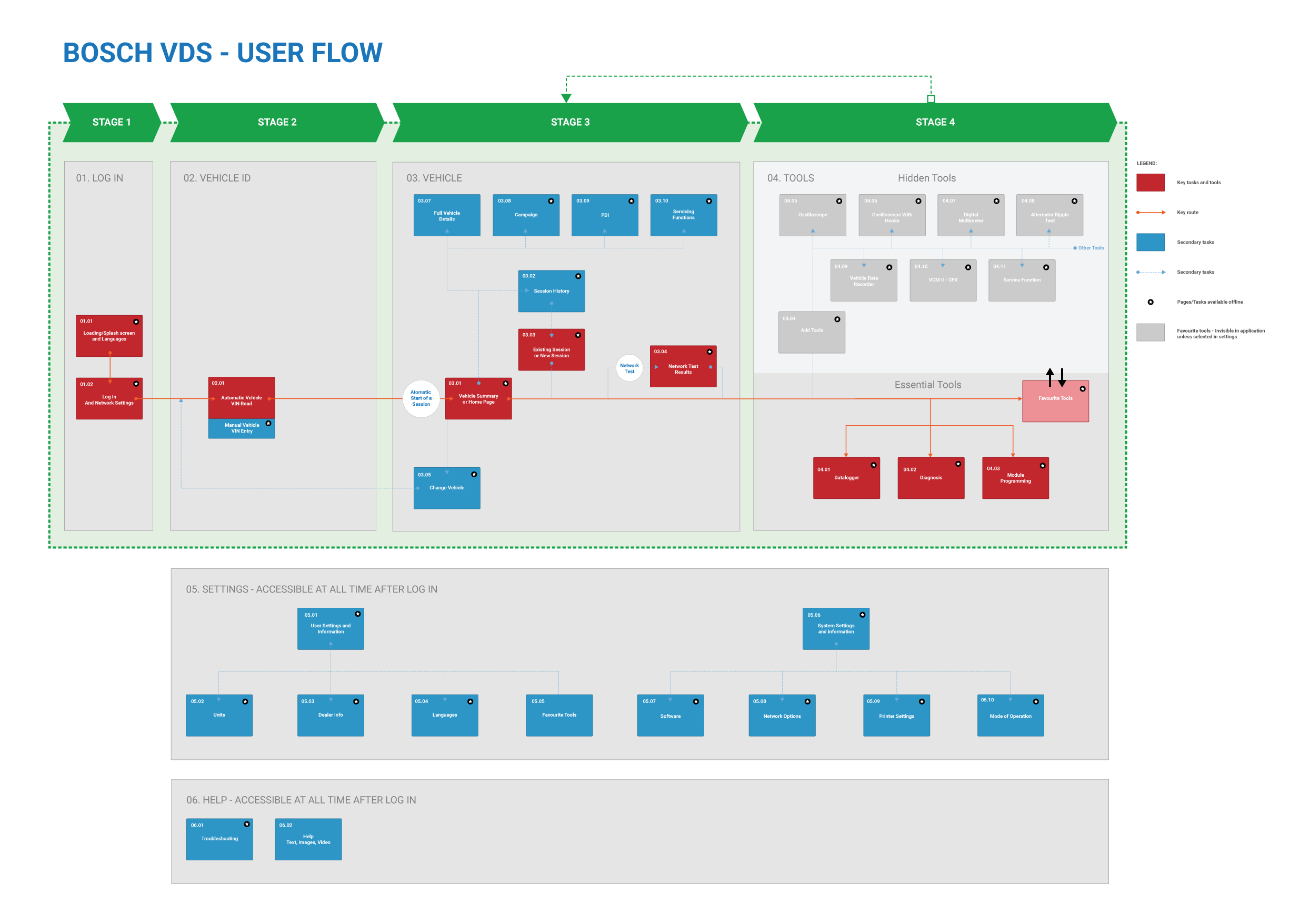
Flow with red route
Empowered by user journeys and critical task analysis, I forged a streamlined user flow with a prominent red route, guiding technicians to peak efficiency. This optimized user flow empowers technicians to diagnose problems faster and more accurately, boosting productivity and customer satisfaction.
Bridging the Gap: From Wireframes to a Connected UI
Wireframing and paper prototypes:
With the information architecture mapped, it was time to zoom in and translate it into tangible screens. Over 40 wireframe layouts emerged, carefully accommodating essential elements and red routes. To test the flow and usability, I crafted a paper prototype, bringing the app to life for internal stakeholders. Although time constraints limited us to an initial test with five individuals, the results provided valuable insights, paving the way for further refinement in the visual design stage.
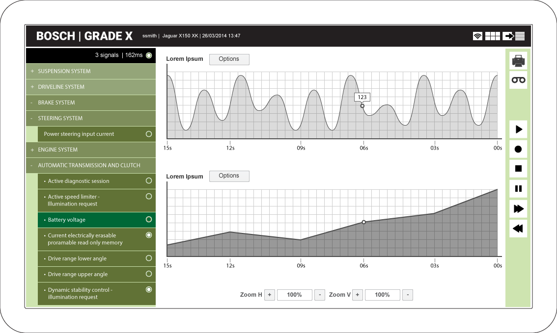
User interface design paterns
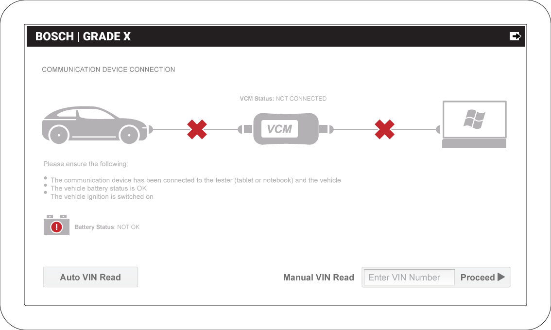
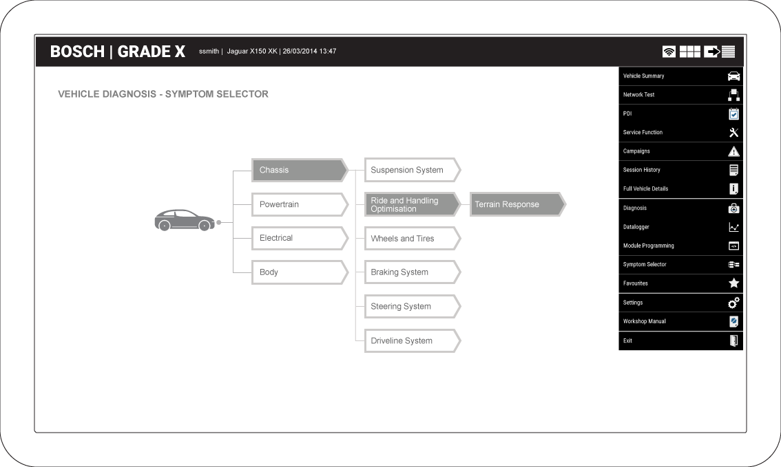
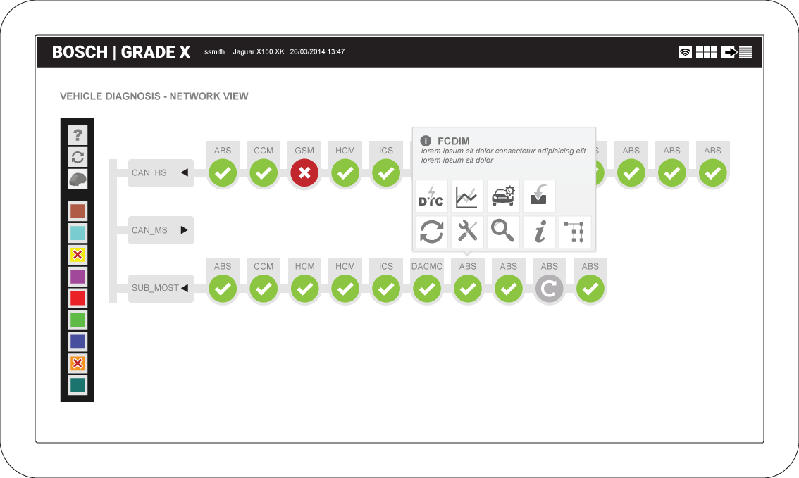
Moving beyond the limitations of outdated guidelines, I forged a cohesive design system with fresh visual patterns. While retaining the brand's signature colours and fonts, this system introduces innovative layouts, intuitive iconography, and a vibrant colour palette, promoting clarity, efficiency, and user satisfaction.
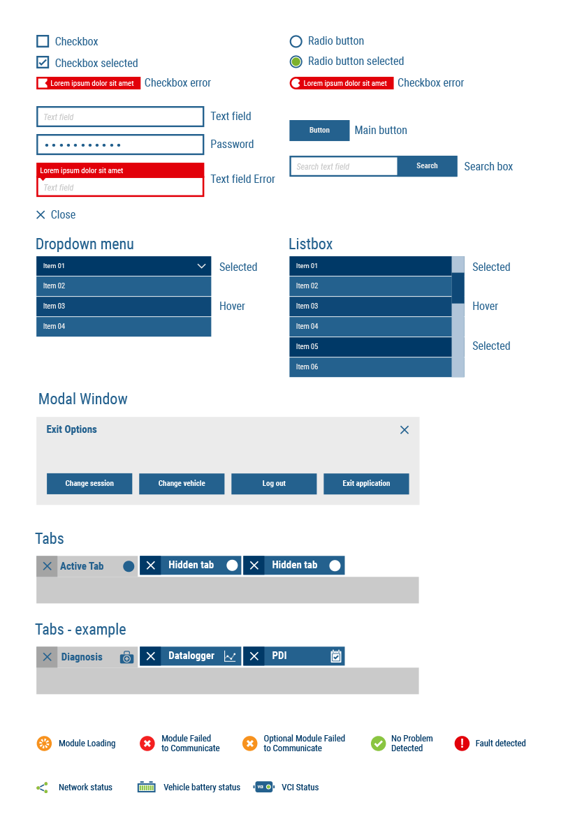
User interface menu design
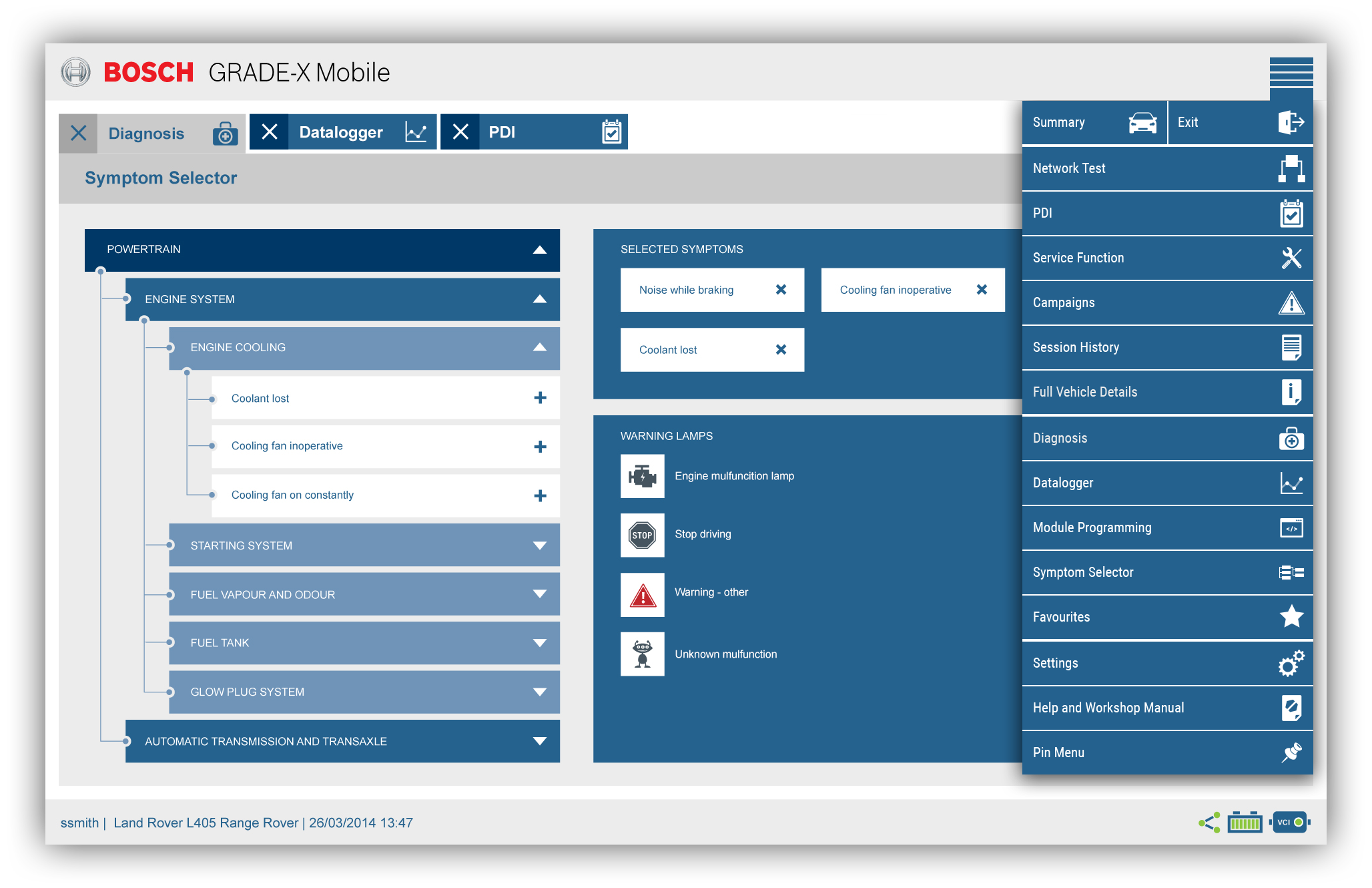
Prioritizing user navigation, I crafted a menu design featuring intuitive icons that metaphorically reflect the diagnostic tools, guiding users seamlessly through Grade X. Recognizing the need for quick access, I designed a dynamic solution - a pinnable menu that keeps essential icons visible without taking up valuable screen space.
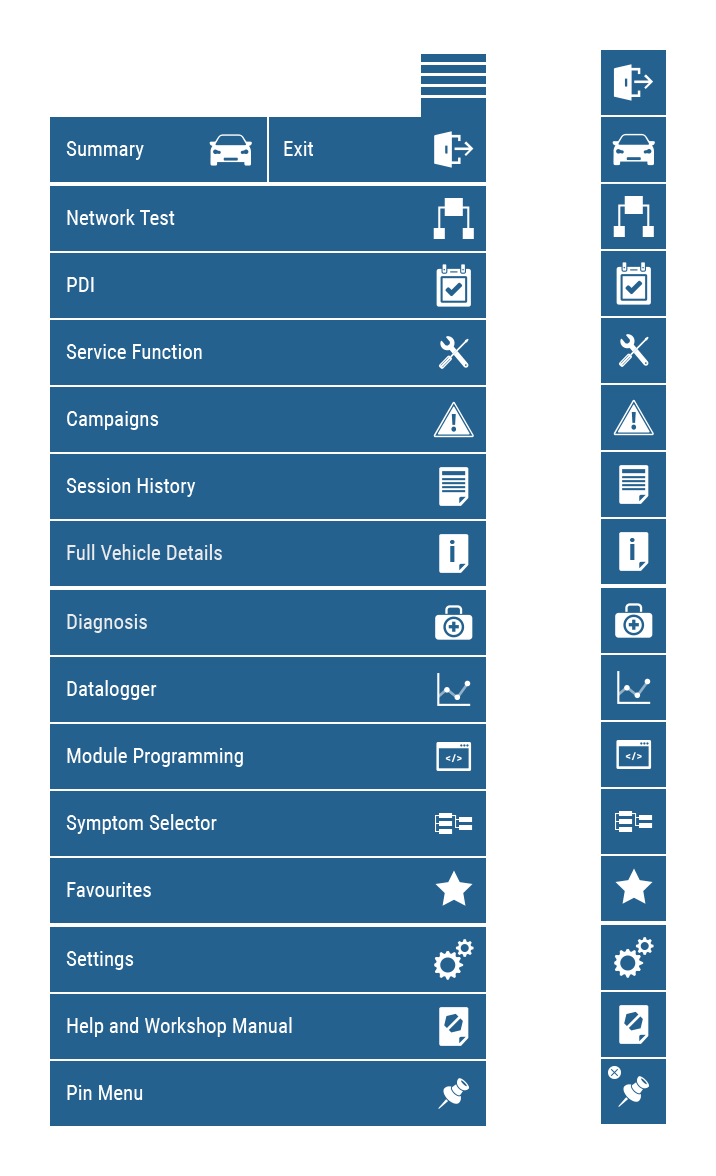
User interface Visual design
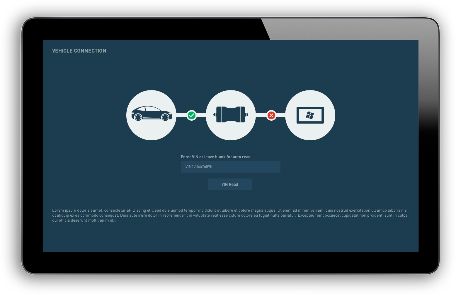
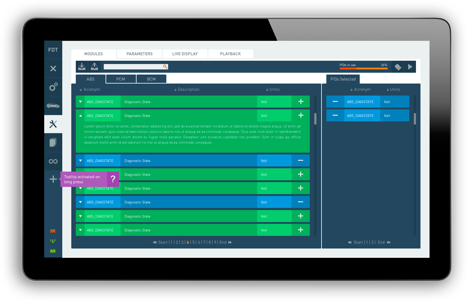
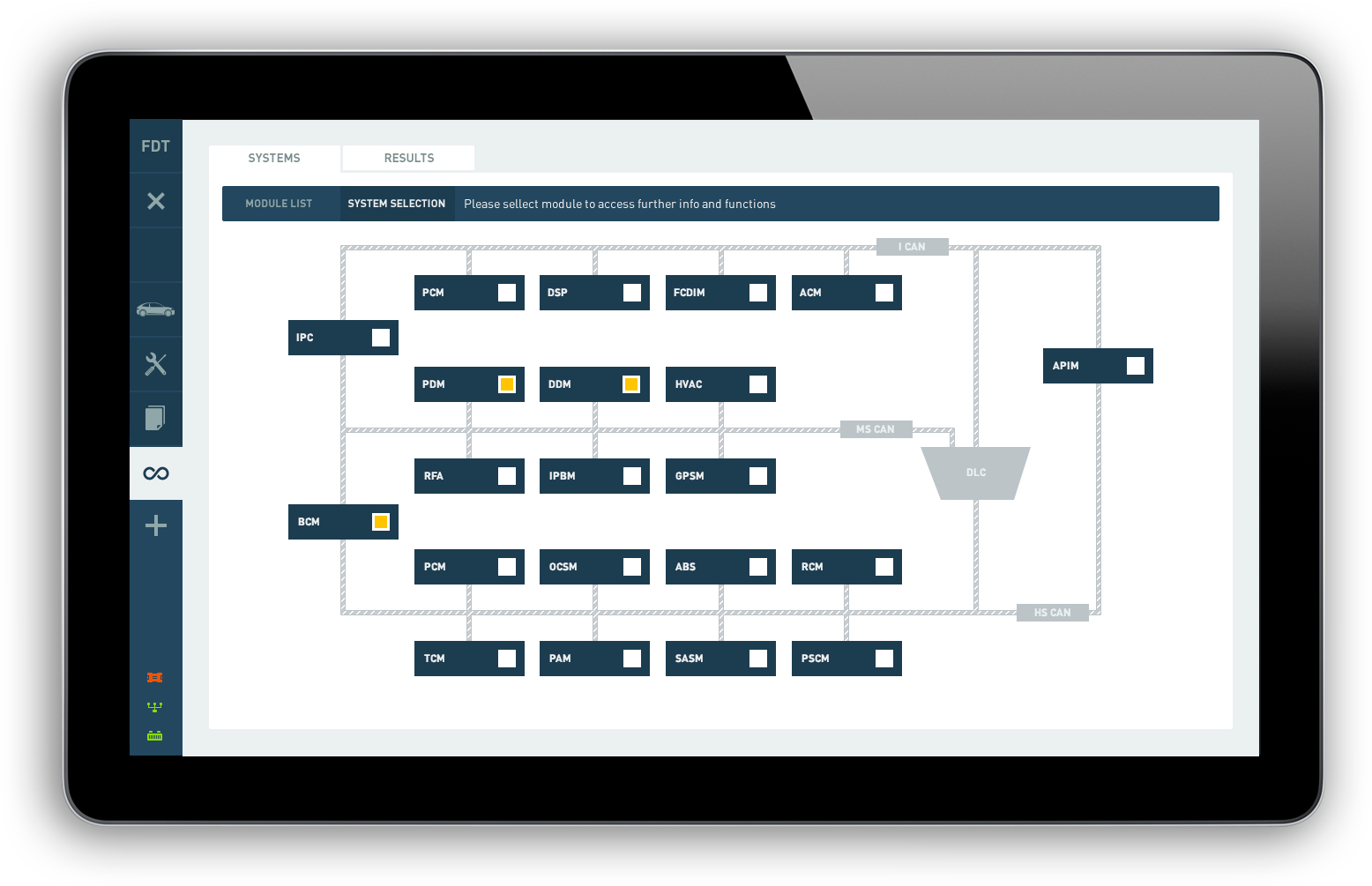
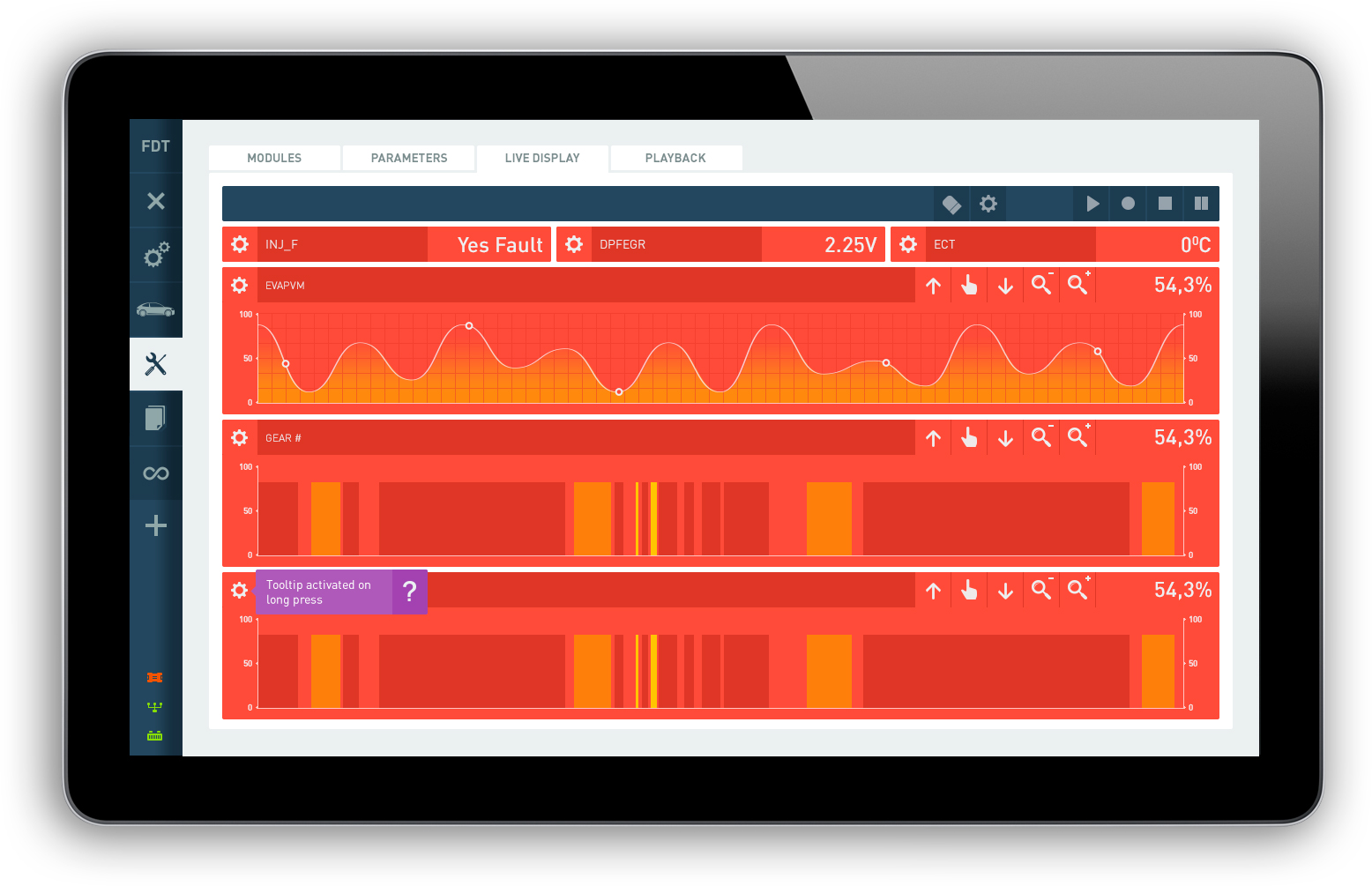
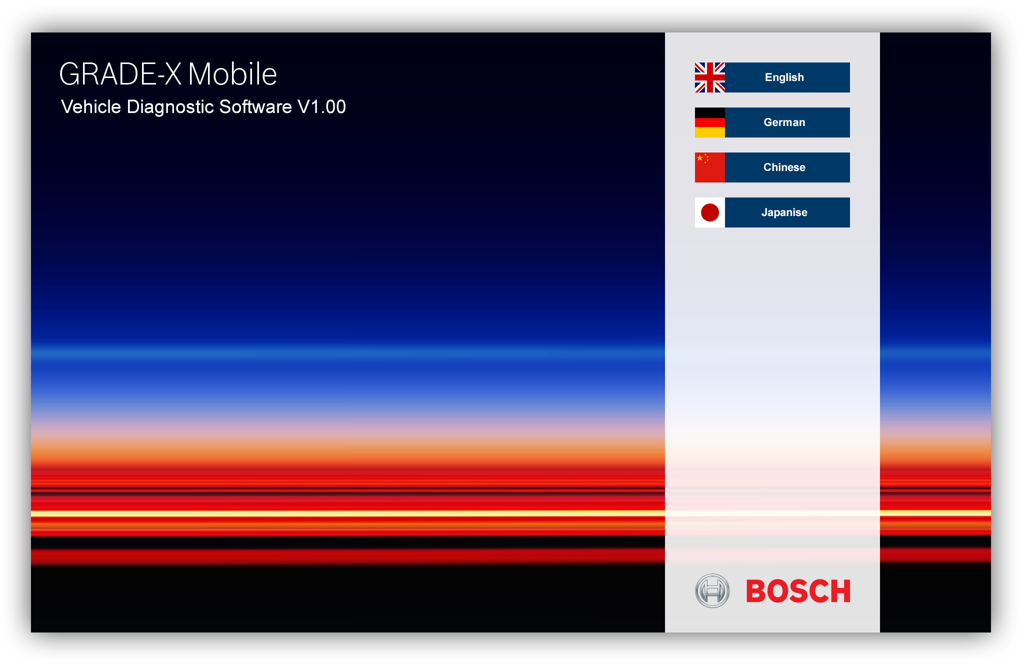
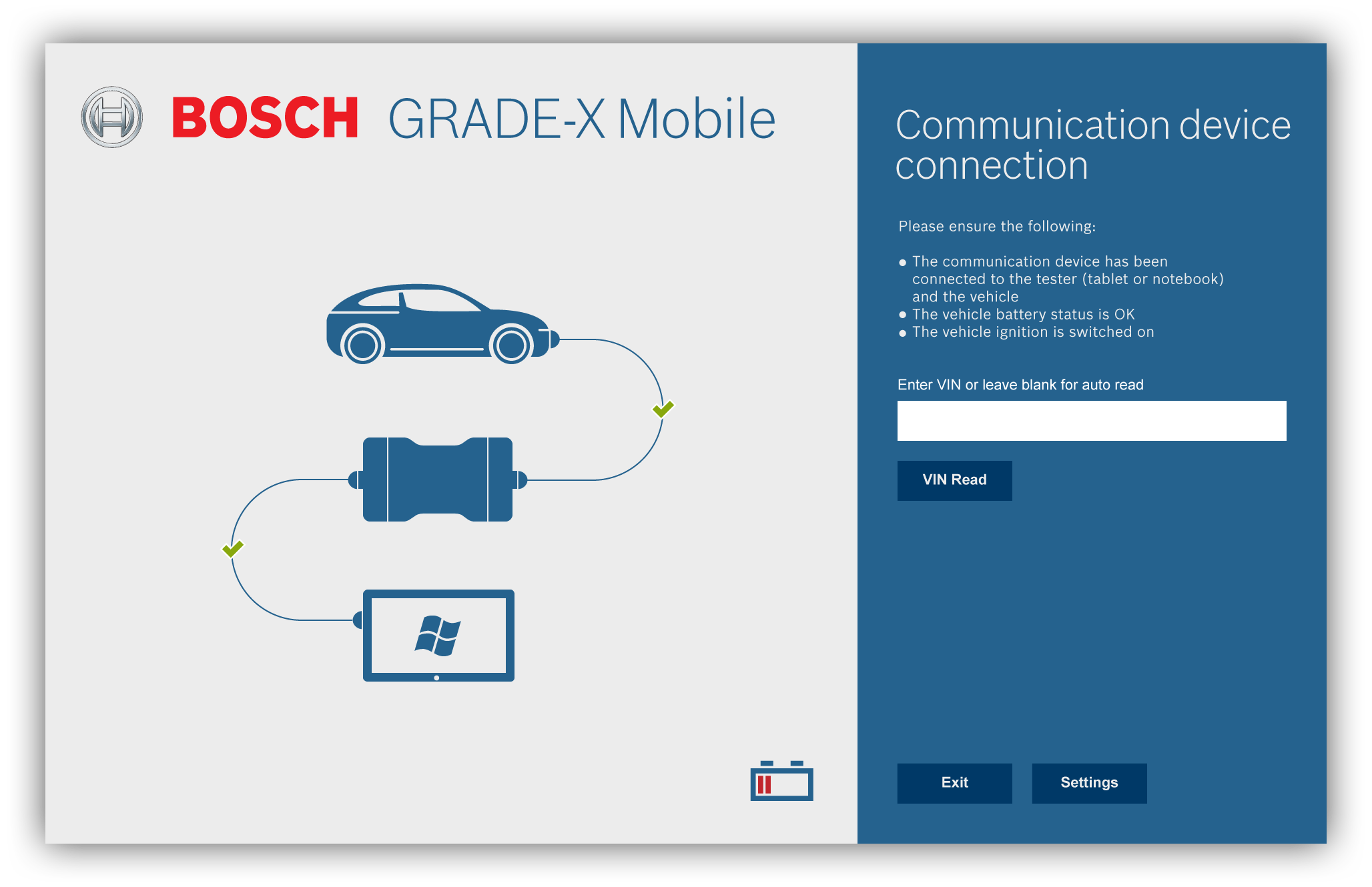
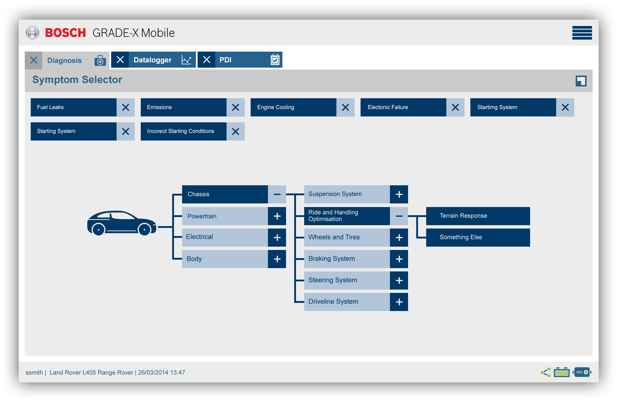
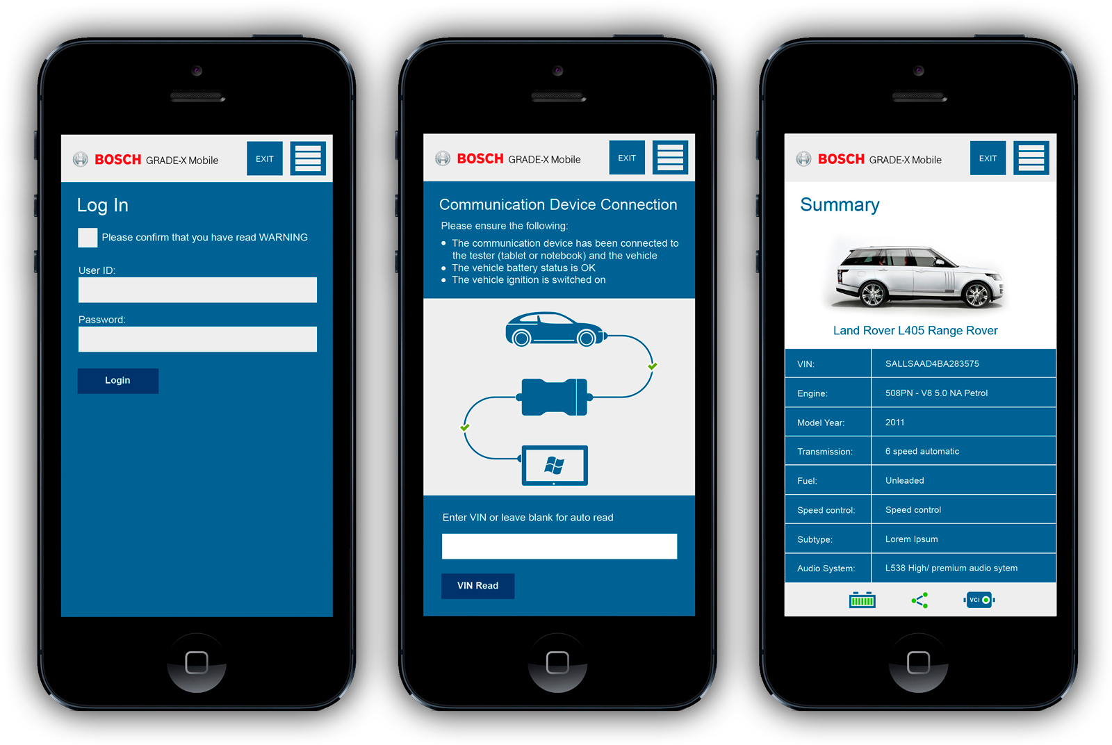
From careful user journeys to perfect design, the final Grade X interface is here! Every part, from the easy-to-use desktop layout to the simple mobile version, is made to help technicians work efficiently. This user-focused design is ready to change the diagnostic experience.
Evaluating the New Grade X: Usability Triumphs
Usability testing
Methodology: To ensure a fair comparison, we employed the same usability testing methods used for the previous version, engaging 18 returning participants and 5 new, younger technicians.
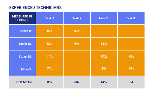
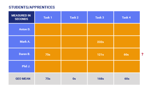
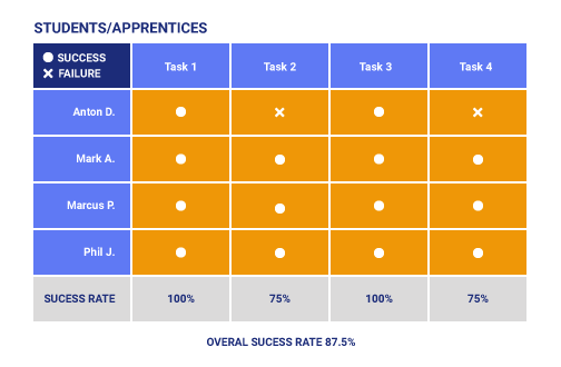
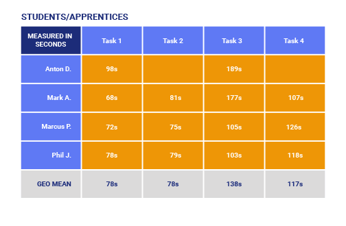
Usability: The results paint a clear picture of progress. Overall success rates soared from 47% to 84%, demonstrating a marked improvement in ease of use, especially among younger users (see figures). Younger technicians also navigated tasks faster, completing them in an average of 91 seconds compared to 99 seconds with the old interface.
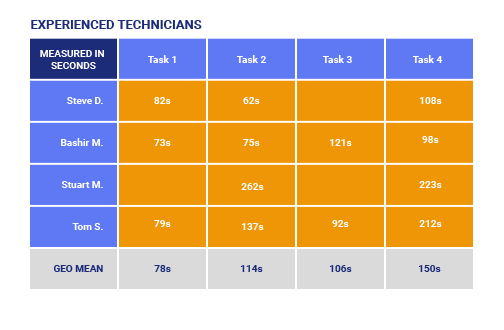
Efficiency: Interestingly, experienced technicians, while achieving a previous best of 82 seconds, took slightly longer (107 seconds) with the new version. This suggests a natural adaptation period for users familiar with the old system. However, their significantly higher success rate indicates better understanding and confidence in using the new features.
Overall, the data reveals a resounding victory for the new Grade X interface. It caters to a wider range of users, boosting both effectiveness and efficiency for both younger and experienced technicians. While some familiarization may be needed initially for seasoned users, the long-term gains in accuracy and confidence outweigh the short-term adjustment period.

Final Words: Bridging the Gap, Building Success
This project proved to be a valuable learning experience, pushing me beyond my comfort zone with Angular JS and into a larger team dynamic. Although my direct design contributions focused on styling, I found immense satisfaction in bridging the gap between design intent and technical implementation. My role pivoted during the development process, allowing me to spend two invaluable weeks supporting the developers. Here, I actively collaborated, clarifying design decisions and fostering open communication.
During this time, the application secured partnerships with major players like Mazda, Mercedes Benz, and Jaguar Land Rover – a testament to its potential and the team's hard work. Looking back, I have two key takeaways for optimizing future design processes:
- Deepening User Insights: While stakeholder feedback indicated user dissatisfaction with the previous product, I believe incorporating a System Usability Scale (SUS) test would have enriched our understanding. This data-driven approach would have provided nuanced insights into user emotional response and specific areas for improvement.
- Enhanced Developer Collaboration: Witnessing the invaluable synergy between design and development during my brief stint, I envision greater benefits from even closer collaboration. Spending more time embedded with the development team would allow me to anticipate potential technical challenges and proactively offer design solutions for minor issues, ultimately streamlining the workflow and ensuring flawless execution.
These reflections are not just personal growth points, but also suggestions for building a more collaborative and data-informed design process. I am confident that by incorporating these learnings, we can continue to create user-centric experiences that surpass expectations and generate real-world impact.
Aftermath
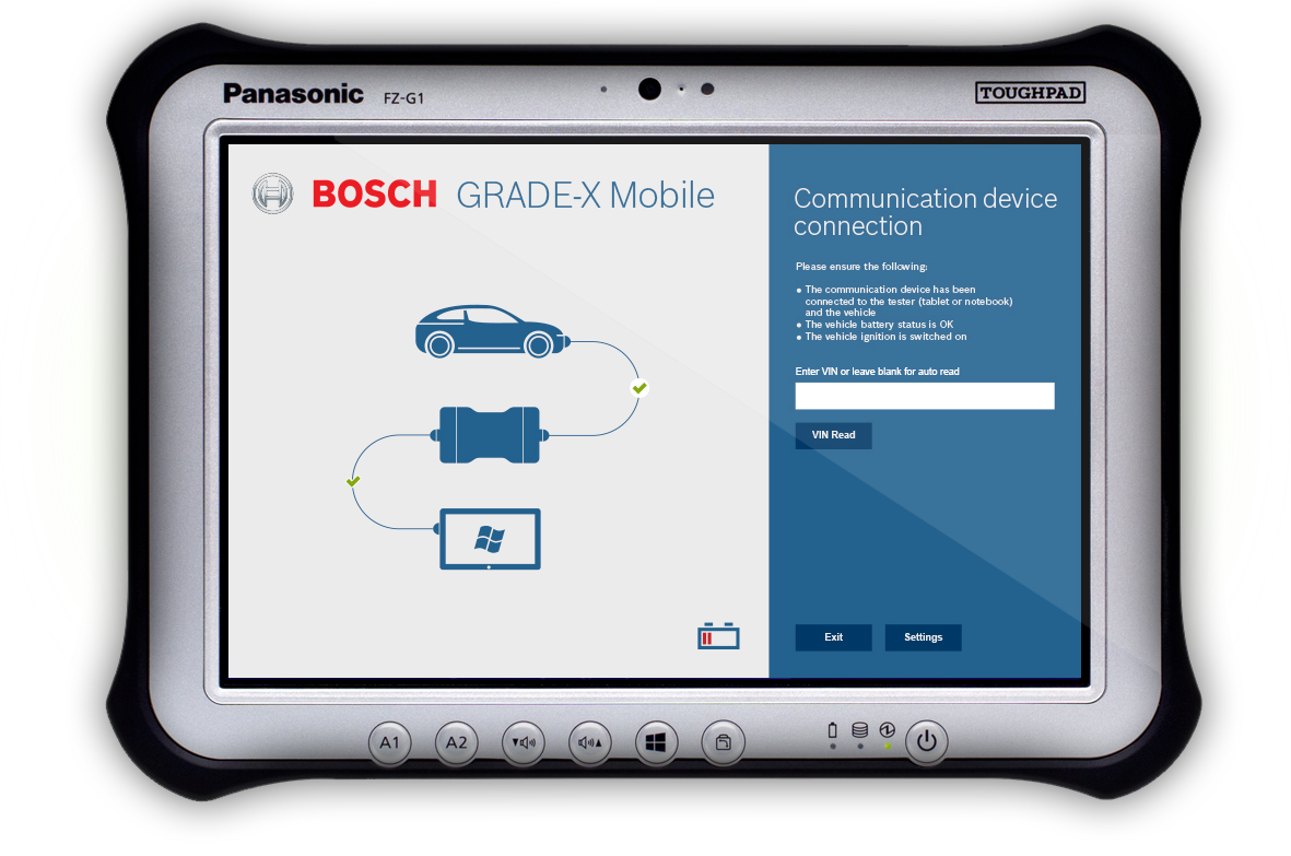
The real success of this project wasn't just the pre-launch sales, but the valuable lessons we learned. Watching users easily navigate the new interface and seeing their confidence grow confirmed the importance of user-focused design. We stayed flexible, adapting to feedback and improving features throughout development.
These lessons are already helping in my work with the Ford team on their new diagnostic platform. While details are confidential, I'm excited to use the insights gained here to create even more seamless and empowering user experiences in the automotive world.
