Demographic Synthesis
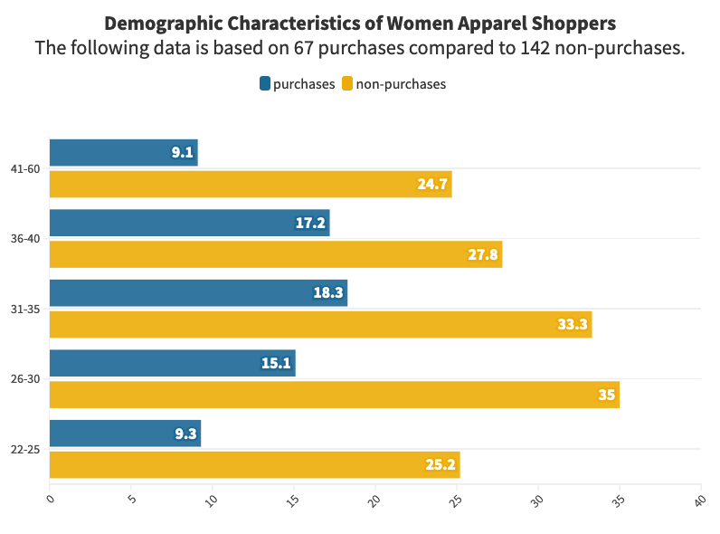
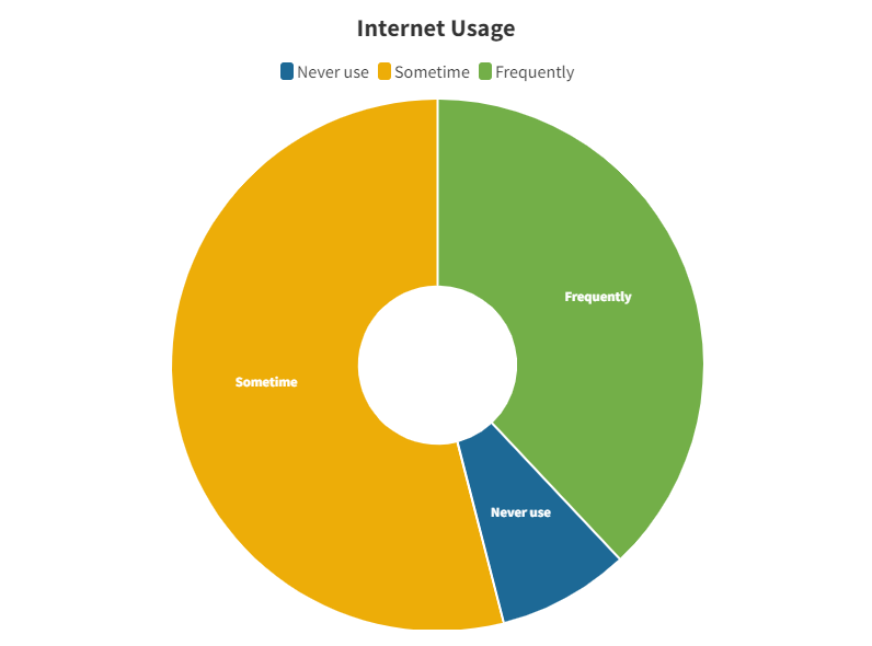
Survey data revealed a core audience aged 26 to 35. While internet usage was high, "browsing fatigue" was common. This data pushed the design toward extreme clarity and speed to prevent users from abandoning the site.
Senior UX/UI Product Designer · UX Design Lead · 20+ Years of Experience · AI-enabled product delivery
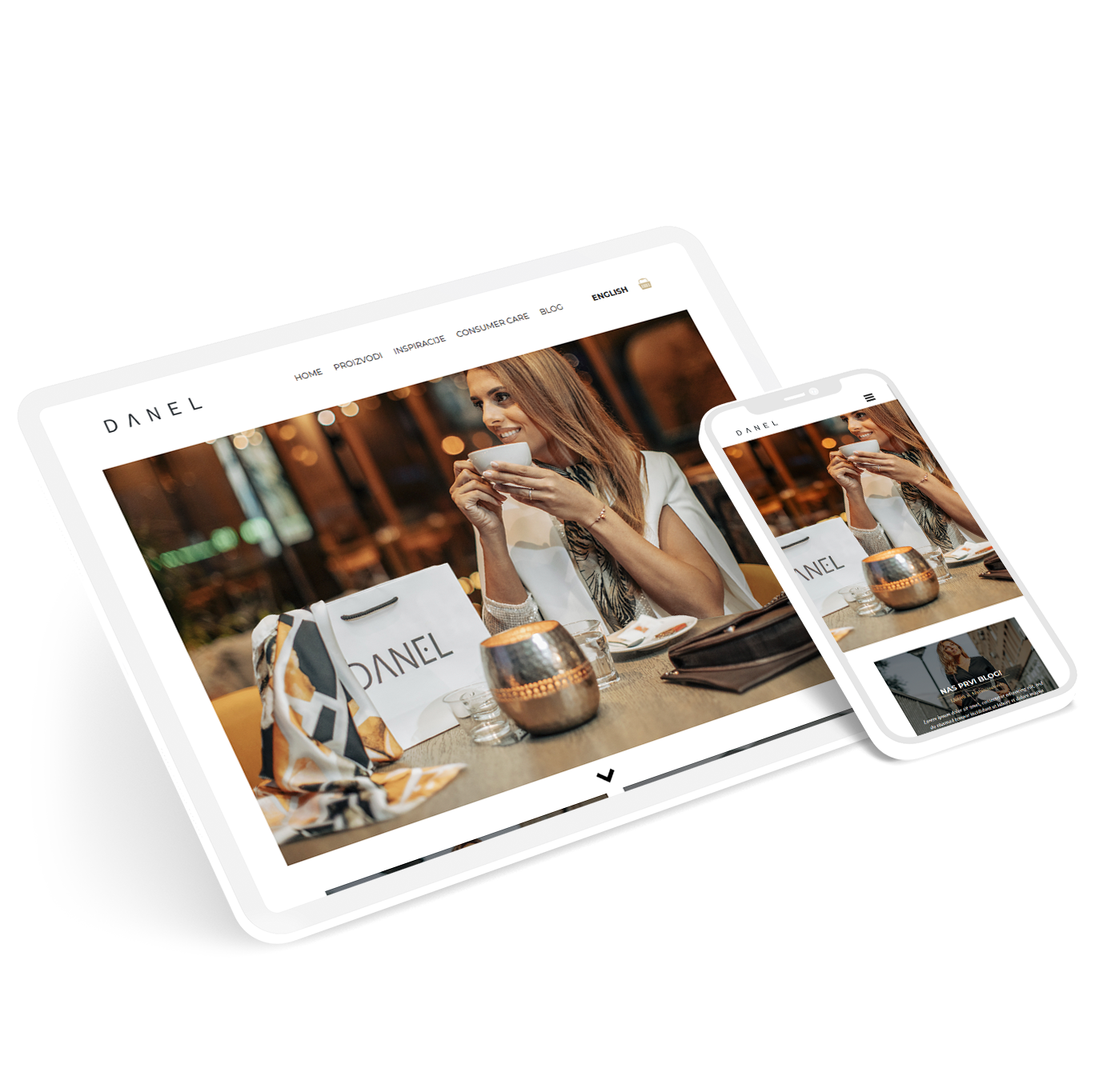
Designing a clean and flexible online shop for a new fashion brand, from idea to launch. This project bridge the gap between creative visual direction and a high-conversion commerce engine.
The first collection sold out shortly after launch, meeting the brand's initial business goals.
Launched a fully responsive custom theme with secure checkout in under a month.
Post-launch iterations ensured 100% of tested users could find size info instantly.
By owning both the design and the build, I ensured zero "design debt" during handoff. The final live site is a pixel-perfect match to the validated Figma prototypes.
Survey data revealed a core audience aged 26 to 35. While internet usage was high, "browsing fatigue" was common. This data pushed the design toward extreme clarity and speed to prevent users from abandoning the site.
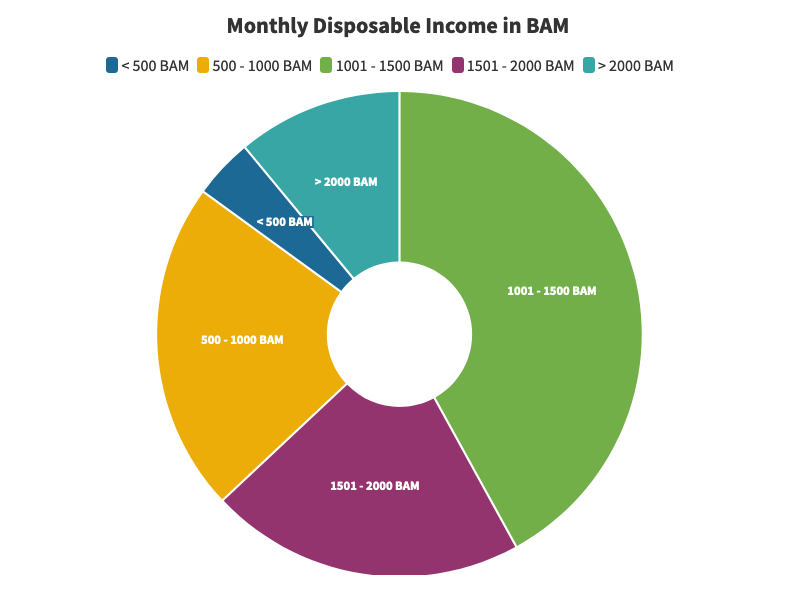
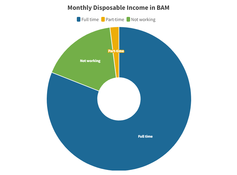
One-to-one interviews surfaced fears regarding online payments and the hassle of returns. This map moved the focus away from "looks" and toward "reassurance."
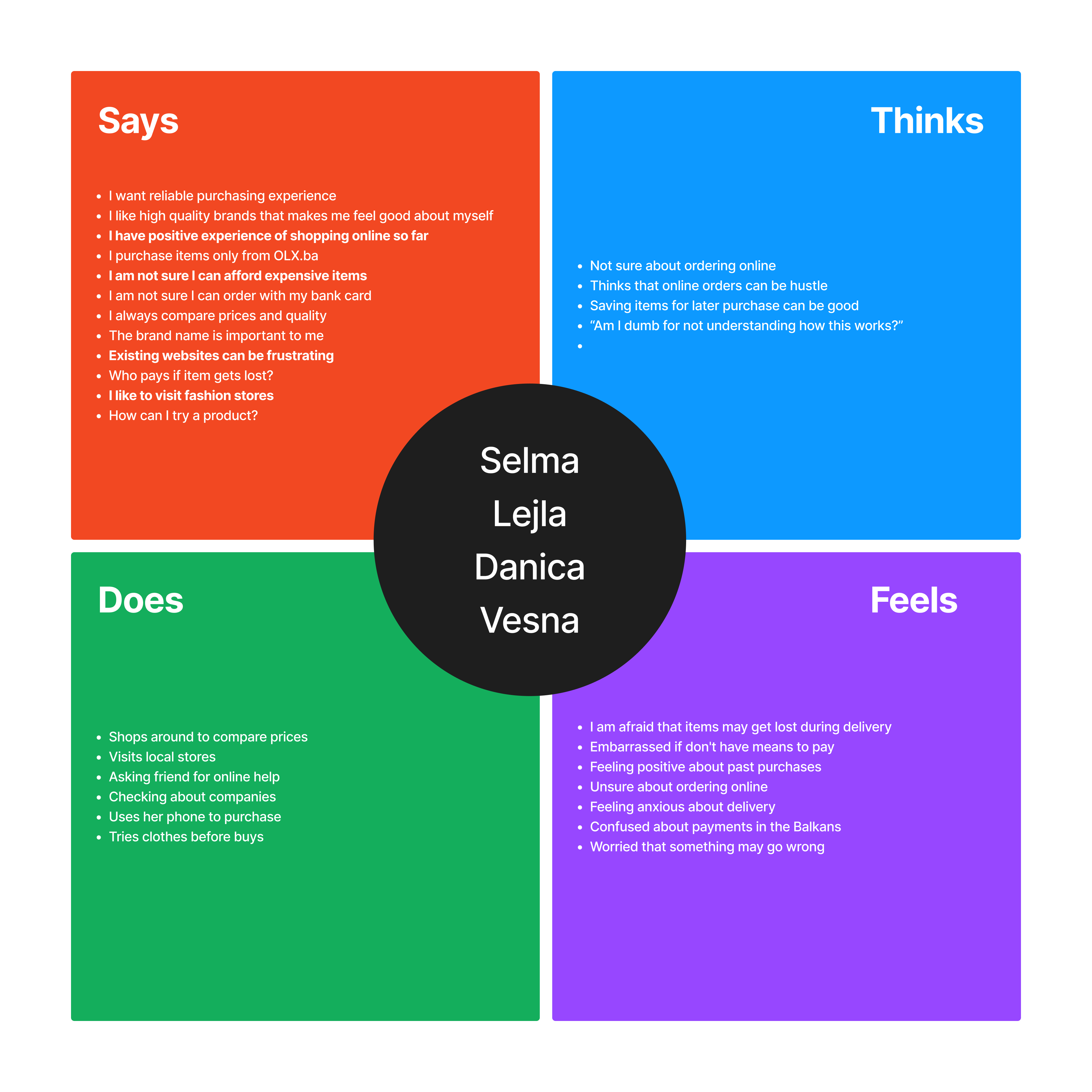
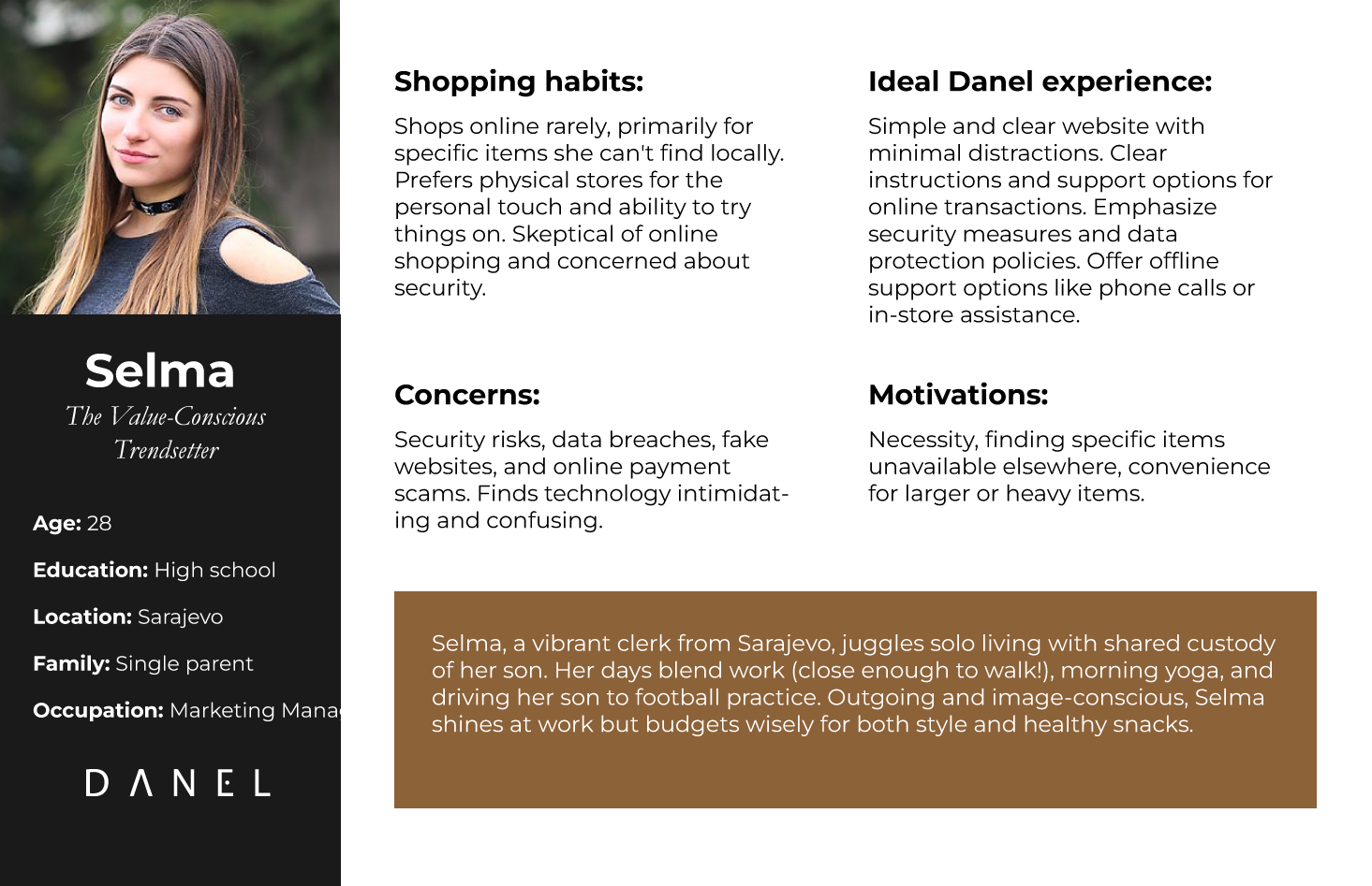
We defined Selma, a marketing manager who shops on her phone during her commute. She needs to find her size quickly and read clear return conditions before committing to a purchase.
The data kept us honest. Instead of guessing, I tailored the tone and visual cues to how this specific group actually lives and works.
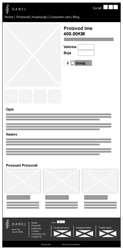
I mapped Selma’s journey from landing to confirmation. This highlighted the "Size Friction Point," leading us to make the size chart a prominent, persistent feature rather than a hidden link.
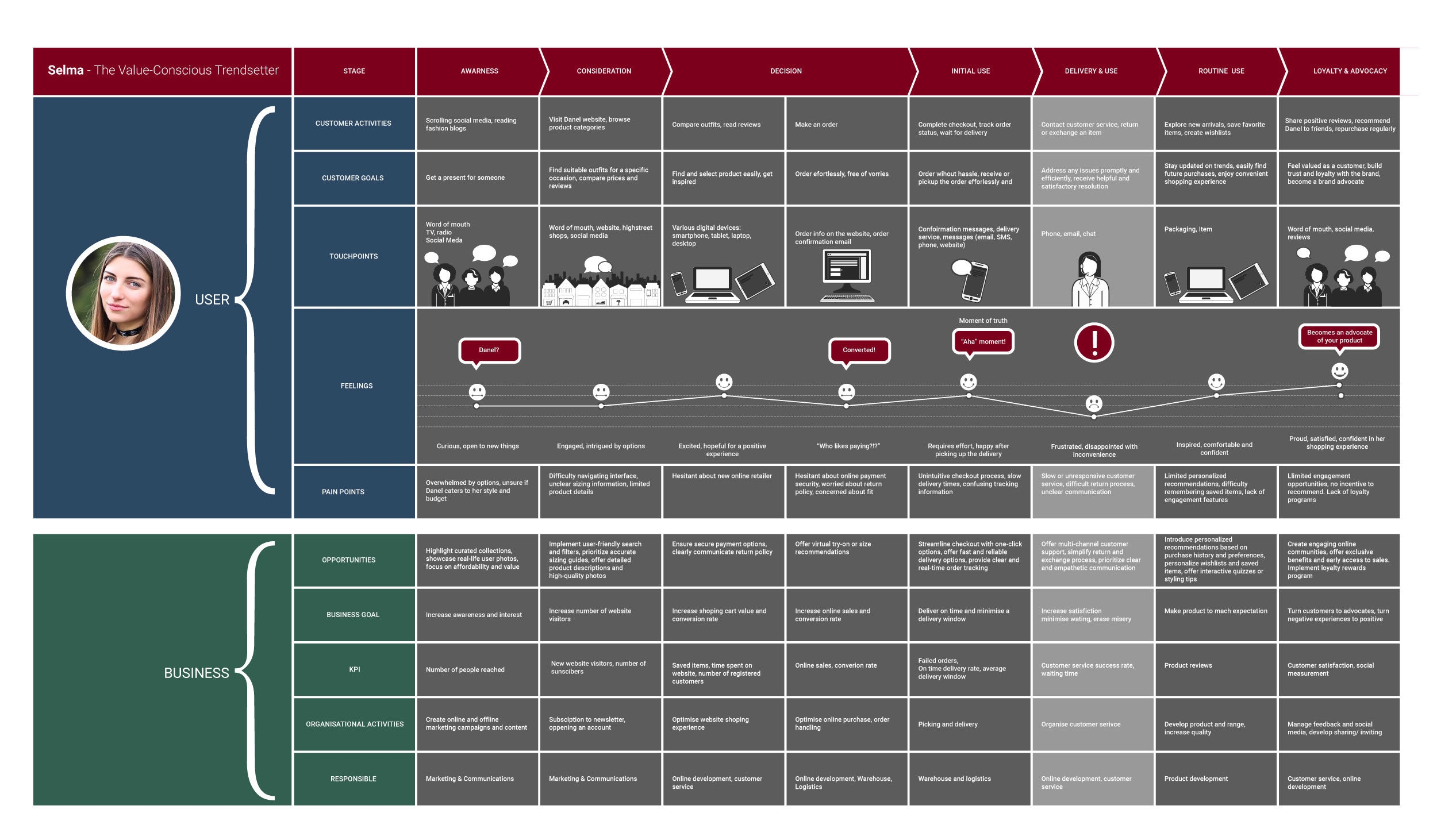
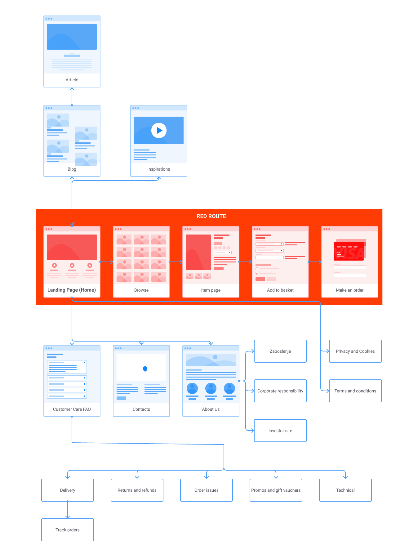
I defined a linear flow: Home to Shop to Product to Cart. This simplicity ensured that Selma could finish her task even with limited attention on a mobile device.
Our goal statement was: "Let Selma buy quickly without stress." If an idea made the flow longer, it was removed. Speed was our primary metric for success.
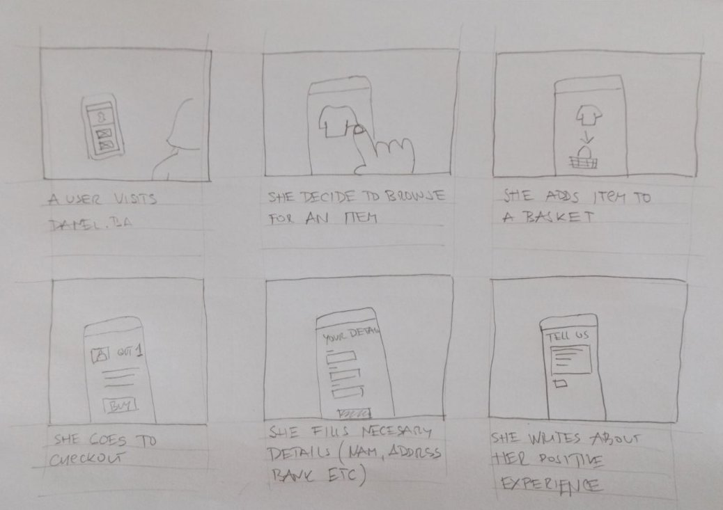
I started with low-fidelity pencil sketches to confirm the content order. Moving into digital wireframes allowed us to test spacing and alignment before committing to the brand's high-contrast aesthetic.
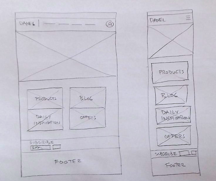
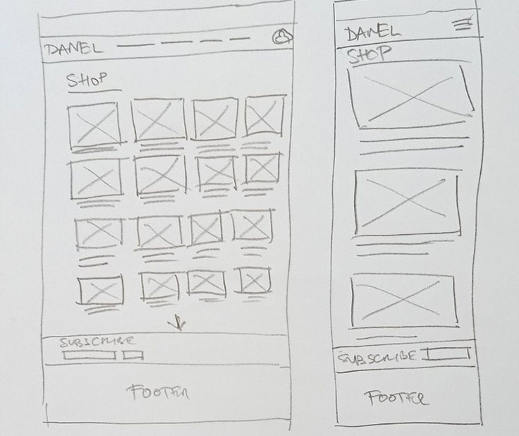
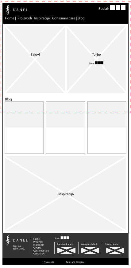

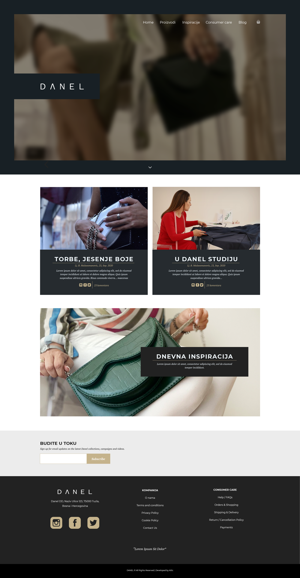
I designed 18 layouts in Figma. The focus was on high-quality product imagery and a calm, minimal color palette that allows the fashion pieces to stand out.
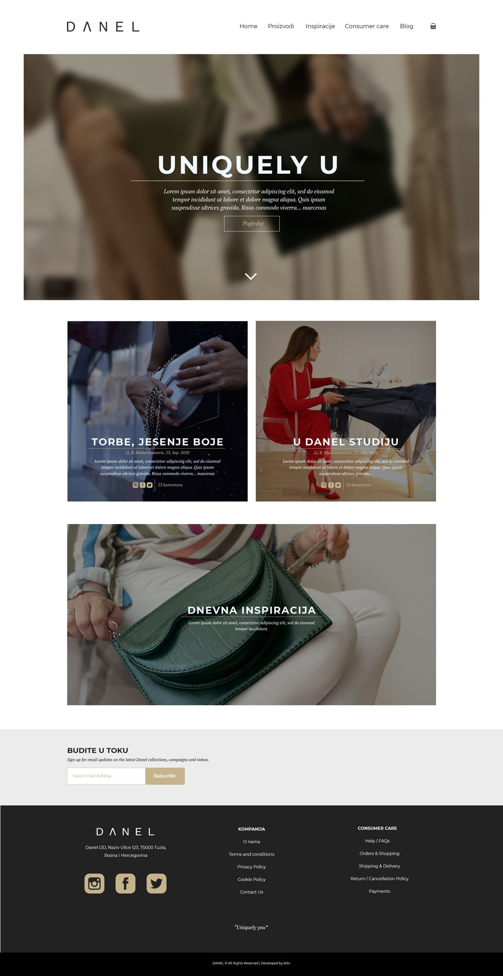
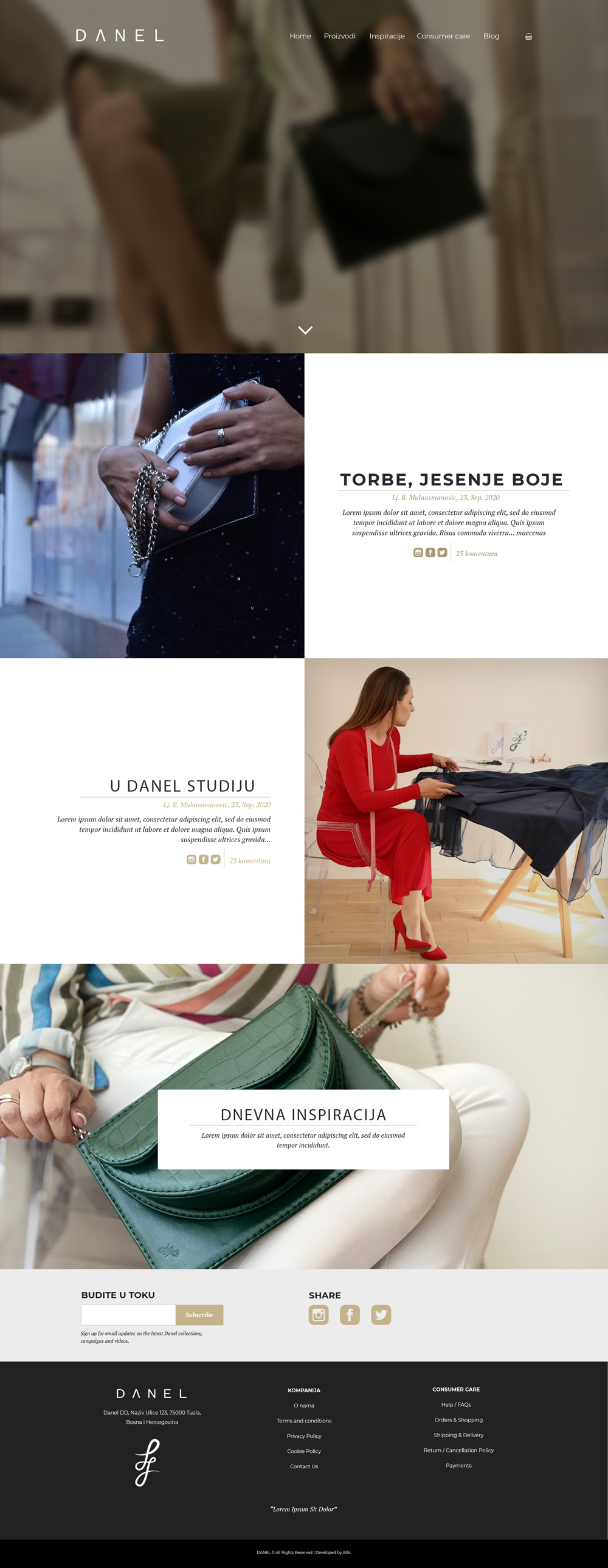
High-fidelity mocks helped the founder see the real site before a single line of code was written. This prevented costly rework during the development phase.
The site was built as a custom theme to match the Figma designs perfectly. I integrated size variations, secure payment gateways, and a clear return policy directly into the checkout flow.
One week after launch, I tested the site with six users. Four struggled with sizing, leading to a critical post-launch update: adding a clear size chart link to every product page and strengthening security cues in the footer.
By owning the UX, UI, and the build, I ensured the brand vision was never diluted by technical constraints. Danel successfully transitioned from a concept to a selling fashion brand with a resilient, user-validated store.