Field Observations & Alignment
I believe in starting in the workshop, not the studio. By observing technicians in busy service stations, I identified the hesitation and "software fighting" that slowed down their throughput.
Senior UX/UI Product Designer · UX Design Lead · 20+ Years of Experience · AI-enabled product delivery
Redesigning high-stakes industrial software. This project streamlined browser-based diagnostics for Bosch workshops, helping technicians complete key tasks faster and with significantly fewer errors.
*Results based on Comparative Task Analysis of legacy vs. new tool.
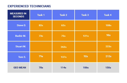
Average diagnostic sessions dropped from 15 minutes to 10.5 minutes.
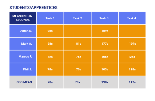
Apprentice success rates rose from 25% to 88% due to improved information hierarchy.
Workshop adoption grew from 60% to 80% following the interface overhaul.
Beyond speed, the error rate in data entry fell from 12% to 7%. This precision is vital in vehicle safety, where misreading a single diagnostic value can lead to incorrect mechanical repairs.
I believe in starting in the workshop, not the studio. By observing technicians in busy service stations, I identified the hesitation and "software fighting" that slowed down their throughput.
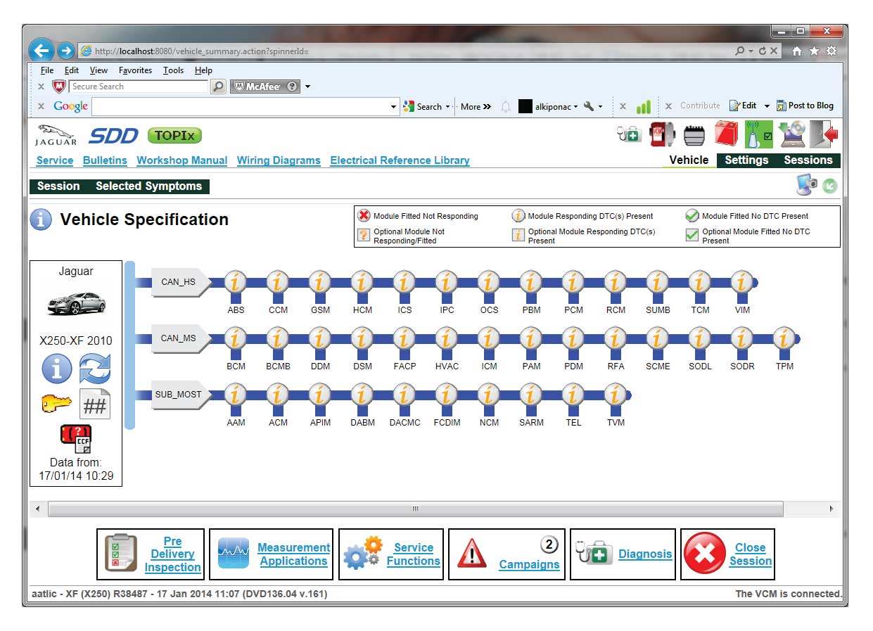
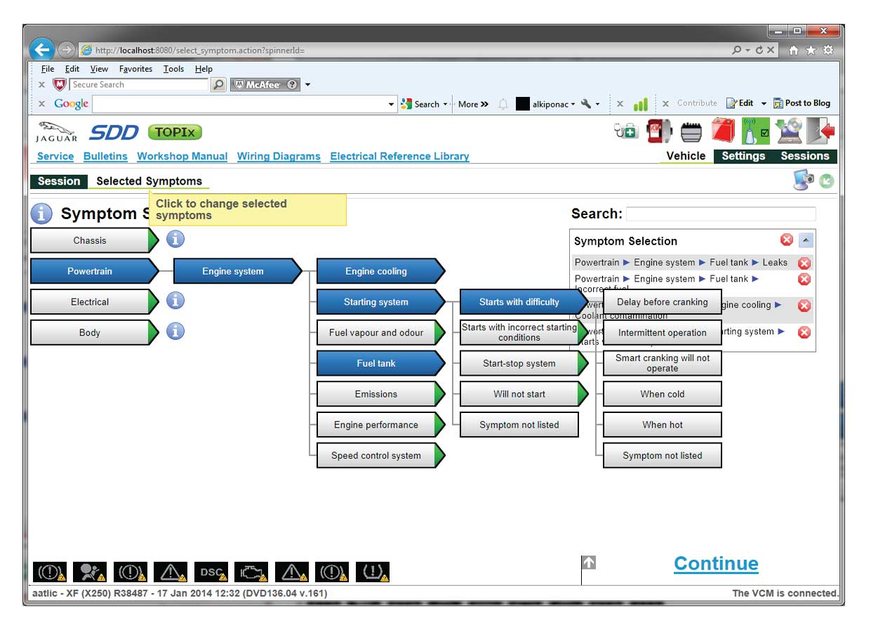
The old UI mixed navigation and content in a dense, overwhelming layout. We recruited 16 technicians of varying ages and experience levels to establish a baseline for our redesign.
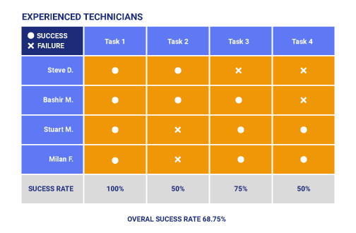
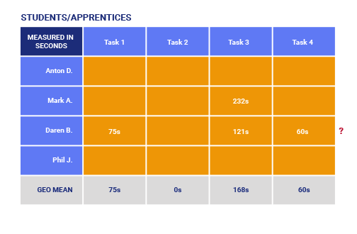
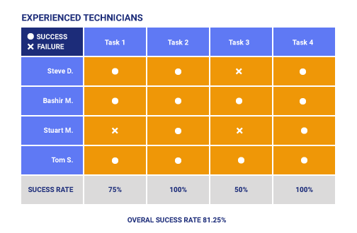
We ran four core tasks on the old software. Senior technicians succeeded 68% of the time, while apprentices struggled significantly with a 25% success rate.
I plotted participants on two axes: experience and tech familiarity. This gave us our "Senior Pro" and "Young Tech" personas, allowing us to design one tool for two speeds of user.
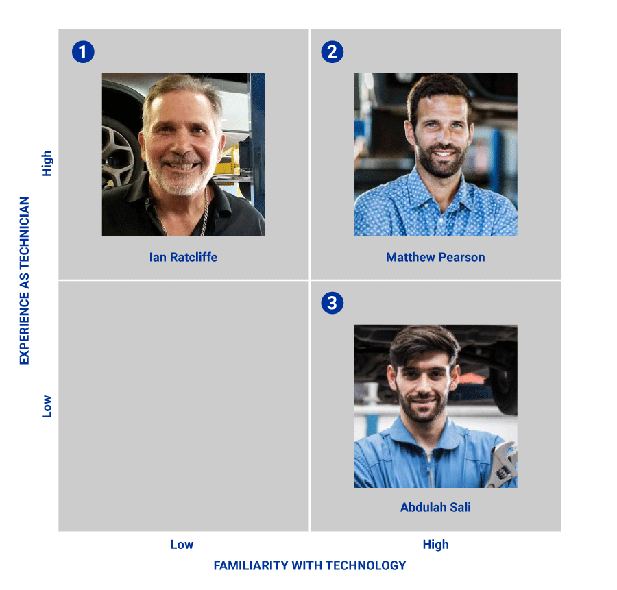
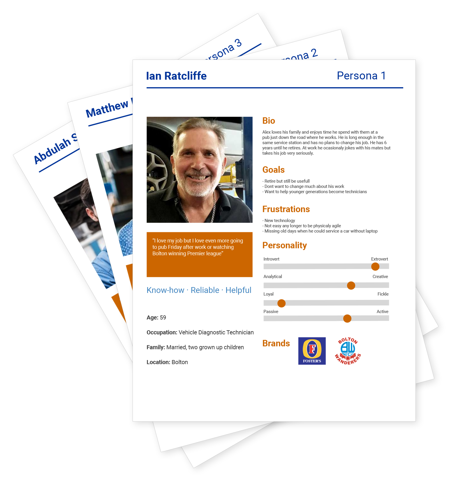
Watching real technicians work revealed that "Senior Pros" needed less visual noise, while "Young Techs" wanted shortcuts. A mixed group made our findings more reliable.
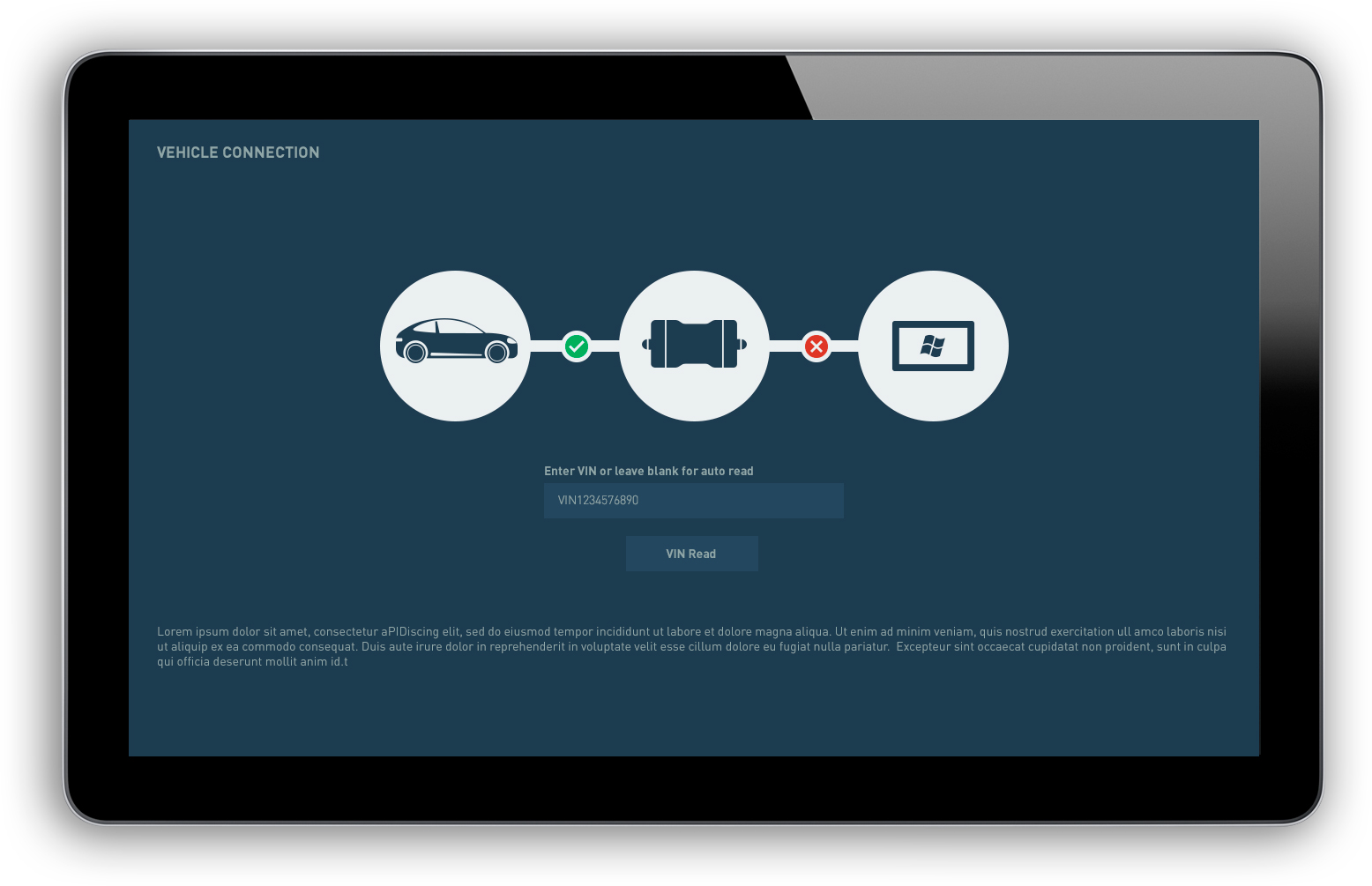
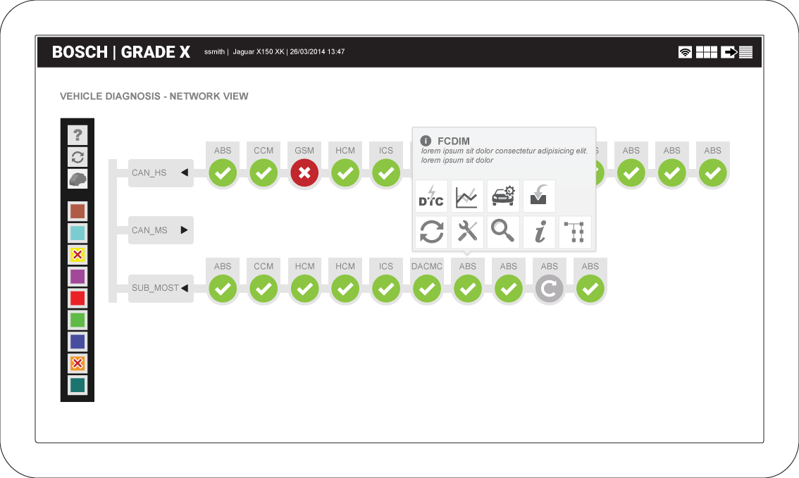
I mapped the journey from login to final report to identify where users broke their flow. We defined one core Red Route: Identify vehicle, run network check, carry out task, then exit.
Through card sorting workshops, we grouped tools into logical categories. We used heatmaps to see which tools were "Always Used" versus "Rarely Used," allowing us to clean up the interface and finalise the system map.
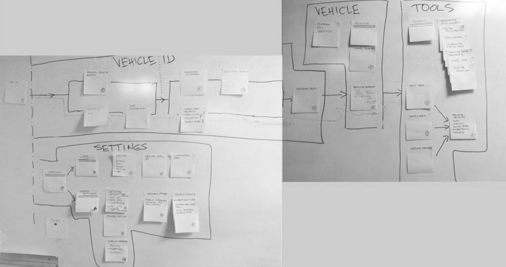
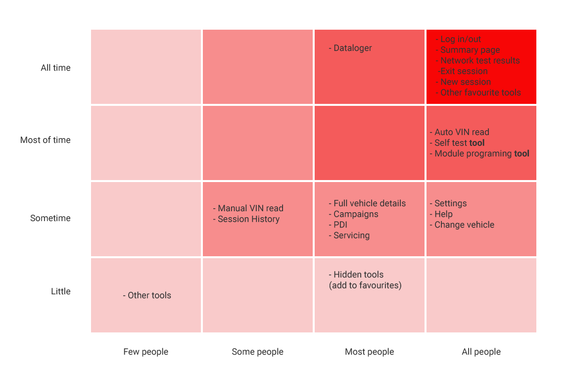
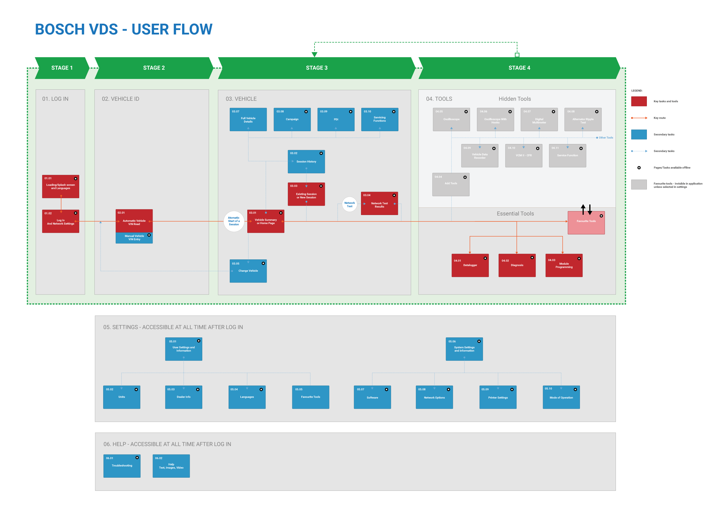
Getting agreement on the basic diagnostic steps early prevented confusion later. Strategy is about finding the shortest path to value, ensuring the most used tools were always "one click" away.
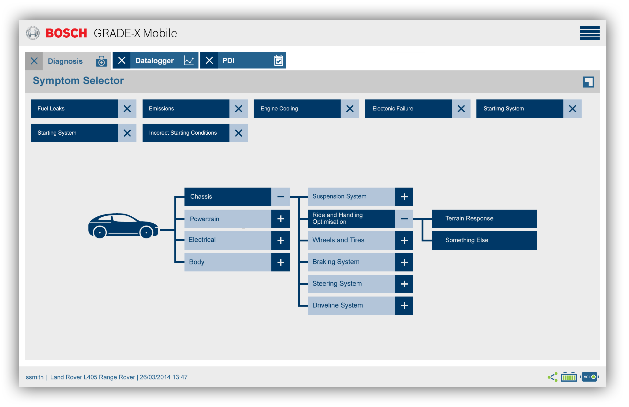
I created over forty low-fidelity wireframes to test task flows from the system map without the distraction of branding. This led to a vertical menu system that can expand for labels or collapse to save screen real estate.
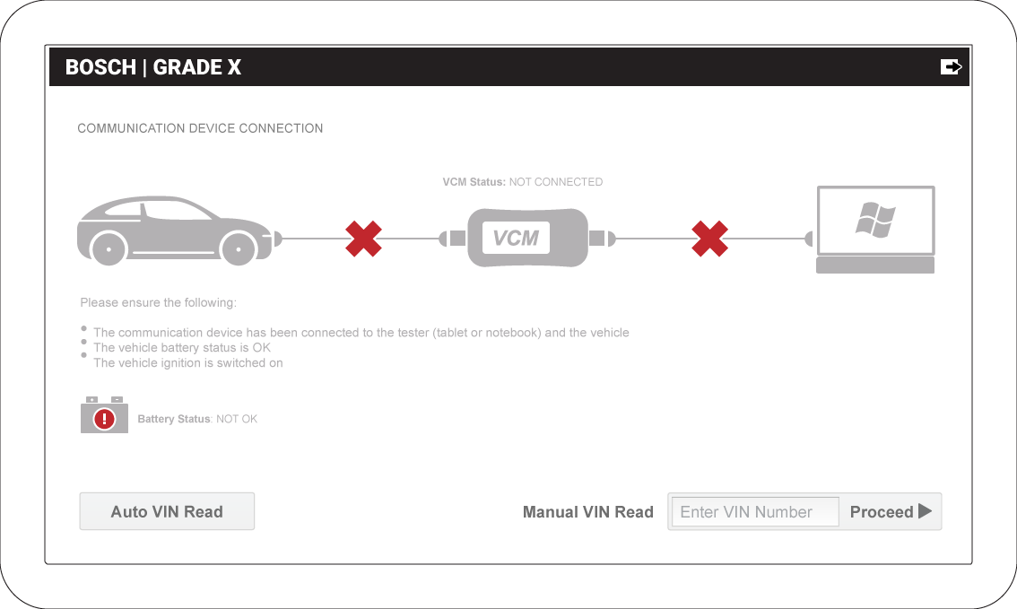
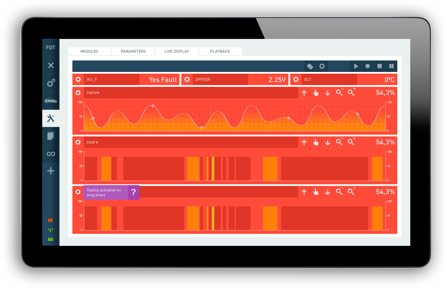
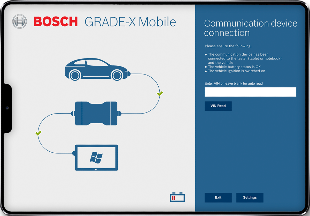
Using Bosch guidelines, I designed a high-contrast interface. We prioritized large, readable data blocks to prevent misreads in the high-glare environment of a service station.
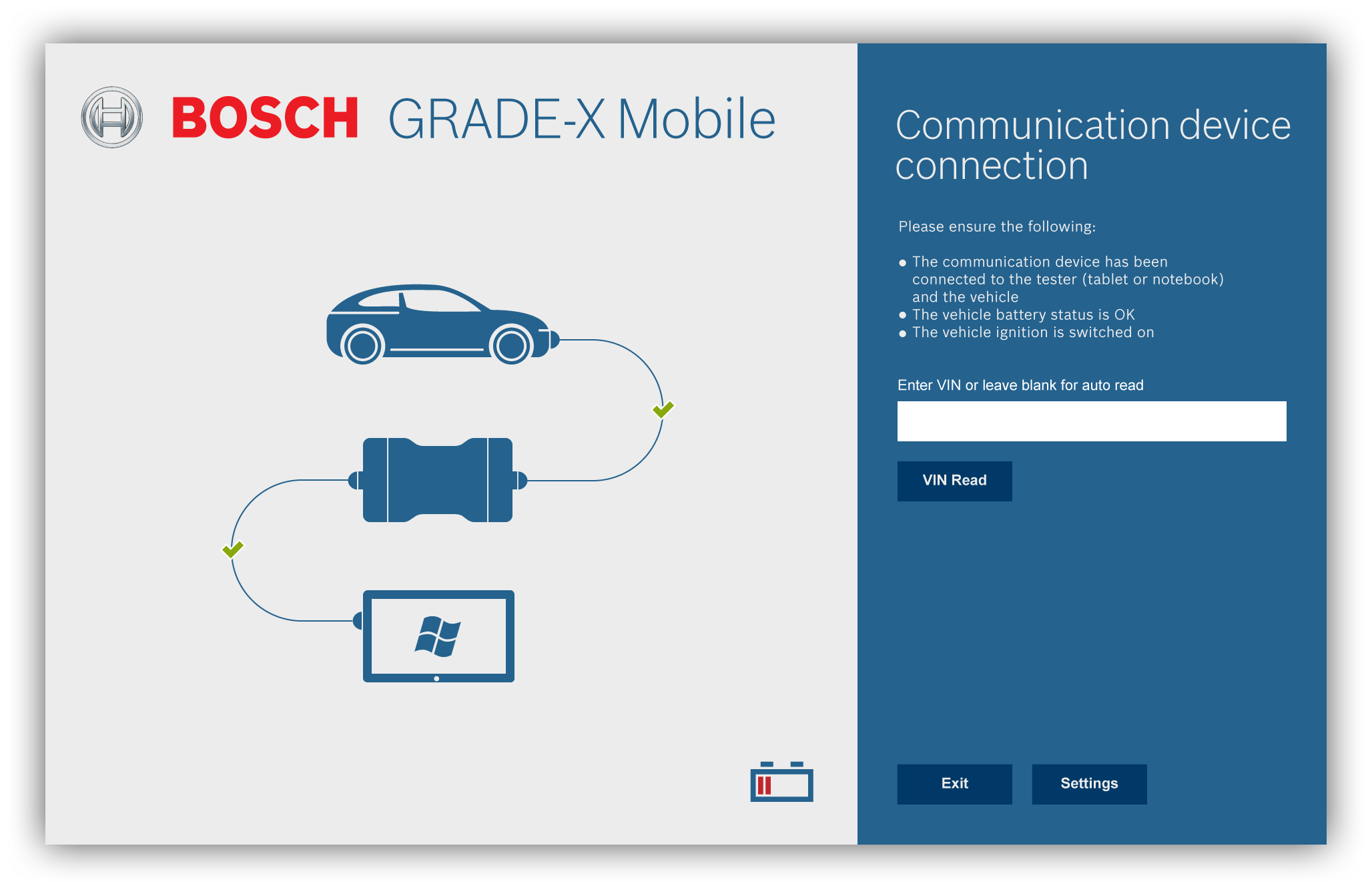
Technicians often move around the vehicle. We adapted the flows for tablets, moving primary actions to the bottom for thumb reach and using drawers for secondary controls.
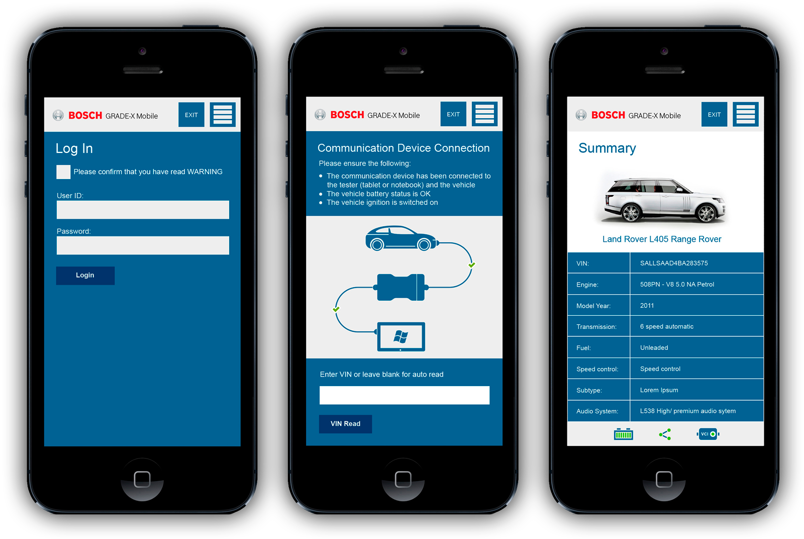
Visual clarity was non-negotiable. Large touch targets and high-contrast tables ensured the tool remained usable for a technician working under a car with a tablet in hand.
We repeated the baseline tasks with the same group. The results were dramatic: apprentices improved their success rate from 25% to 87.5%, actually completing tasks faster than some seniors.

Apprentices completed tasks faster than seniors because the new hierarchy removed the need for deep domain knowledge to navigate the UI. Seniors became more accurate, accepting a slight time trade-off for higher confidence in their results.
Giving technicians a stable Red Route with optional shortcuts worked better than designing separate interfaces. It supported both the cautious senior and the fast-moving apprentice.
Most of our gains came from clearer labels and better grouping, not new features. Simplifying how people reach existing tools provided the most significant business impact.
The success of Grade X led Bosch to apply this same design system to the Ford Diagnostic Tool. By reusing our Red Route thinking and IA patterns, we reduced the risk and timeline of the Ford project significantly.